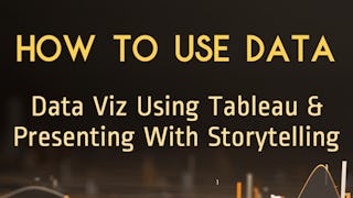
Elevate your data storytelling skills with "Interactive, Geospatial & Narrative Data Visualization" . This comprehensive program covers the essentials of visualizing data through interactive dashboards, geospatial analysis, and narrative visualization using Python and Tableau. Learn to design and implement interactive visualizations that improve user engagement and make complex data more accessible. Explore geospatial data to create compelling maps and understand spatial relationships. Dive into narrative visualization to craft engaging data stories that convey insights effectively.

Interactive, Geospatial & Narrative Data Visualization

Interactive, Geospatial & Narrative Data Visualization
This course is part of Data Visualization: Fundamentals to Interactive Storytelling Specialization

Instructor: P.J. Grosse
Access provided by Institute of Entrepreneurs Development
Gain insight into a topic and learn the fundamentals.
Intermediate level
Some related experience required
2 weeks to complete
at 10 hours a week
Flexible schedule
Learn at your own pace
What you'll learn
Create interactive visualizations using Python libraries like Matplotlib and Seaborn.
Develop stunning geospatial visualizations with tools such as Folium and Tableau.
Craft narrative visualizations to communicate insights effectively.
Implement advanced data visualization techniques for comprehensive analysis.
Skills you'll gain
- Tableau Software
- Heat Maps
- Spatial Analysis
- Data Presentation
- Data Visualization
- Matplotlib
- Data Storytelling
- Geospatial Information and Technology
- Seaborn
- Network Analysis
- Data Ethics
- Visualization (Computer Graphics)
- Infographics
- Data Visualization Software
- Data Mapping
- Text Mining
- Geospatial Mapping
- Interactive Data Visualization
Details to know

Shareable certificate
Add to your LinkedIn profile
Assessments
10 assignments
Taught in English
Recently updated!
August 2025
See how employees at top companies are mastering in-demand skills

Build your subject-matter expertise
This course is part of the Data Visualization: Fundamentals to Interactive Storytelling Specialization
When you enroll in this course, you'll also be enrolled in this Specialization.
- Learn new concepts from industry experts
- Gain a foundational understanding of a subject or tool
- Develop job-relevant skills with hands-on projects
- Earn a shareable career certificate

There are 5 modules in this course
This module describes forms of interactions when working with data visualizations and the principles of how to most effectively support interaction with data visualization.
What's included
5 videos5 readings2 assignments3 discussion prompts1 plugin
This module presents maps as a form of data visualization, describes what geospatial data is, and what different forms of map visualization are possible.
What's included
4 videos6 readings2 assignments3 discussion prompts
This module teaches how to create map visualization in Python and Tableau.
What's included
3 videos5 readings2 assignments3 ungraded labs
This module introduces the transformation of text into visual representation, providing basics of how text is treated as data, and what techniques can be used to visualize text.
What's included
4 videos2 readings2 assignments1 discussion prompt
This module teaches how to visual data storytelling and how to transform visualizations as forms of art, using guidelines from Tufte’s principles of visualization.
What's included
4 videos6 readings2 assignments
Earn a career certificate
Add this credential to your LinkedIn profile, resume, or CV. Share it on social media and in your performance review.
Build toward a degree
This course is part of the following degree program(s) offered by University of Pittsburgh. If you are admitted and enroll, your completed coursework may count toward your degree learning and your progress can transfer with you.¹
Instructor
Offered by


Why people choose Coursera for their career

Felipe M.
Learner since 2018
"To be able to take courses at my own pace and rhythm has been an amazing experience. I can learn whenever it fits my schedule and mood."

Jennifer J.
Learner since 2020
"I directly applied the concepts and skills I learned from my courses to an exciting new project at work."

Larry W.
Learner since 2021
"When I need courses on topics that my university doesn't offer, Coursera is one of the best places to go."

Chaitanya A.
"Learning isn't just about being better at your job: it's so much more than that. Coursera allows me to learn without limits."
Explore more from Data Science
University of Pittsburgh
University of Pennsylvania