Seaborn Courses
Seaborn courses can help you learn data visualization techniques, statistical graphics, and how to create informative plots. You can build skills in customizing visual aesthetics, interpreting data distributions, and enhancing visual storytelling through effective color palettes and themes. Many courses introduce tools like Python and Jupyter Notebooks, which facilitate hands-on practice and real-time data analysis, allowing you to apply your skills in various data-driven projects.
Popular Seaborn Courses and Certifications
 Status: Free Trial
Skills you'll gain: Seaborn, Data Storytelling, Data Presentation, Statistical Visualization, Data Visualization, Data Visualization Software, Matplotlib, Plot (Graphics), Statistical Analysis, Python Programming
 Status: Free Trial
Skills you'll gain: Data Wrangling, Exploratory Data Analysis, Model Evaluation, Data Cleansing, Data Preprocessing, Data Manipulation, Data Analysis, Data Processing, Model Training, Scatter Plots, Statistical Analysis, Predictive Modeling, Regression Analysis, Statistical Methods, Data Transformation, Feature Engineering, Data Import/Export, Scientific Visualization, Data Visualization, Python Programming
 Status: Free Trial
Skills you'll gain: Matplotlib, Histogram, Plot (Graphics), Data Visualization, Seaborn, Scatter Plots, Data Visualization Software, Scientific Visualization, Interactive Data Visualization, Statistical Visualization, Exploratory Data Analysis, Graphing, Python Programming
Skills you'll gain: Matplotlib, Seaborn, Plot (Graphics), Scatter Plots, Histogram, Data Visualization, Data Visualization Software, Graphing, Statistical Visualization, Data Analysis, Python Programming
Skills you'll gain: Exploratory Data Analysis, Seaborn, Plotly, Data Visualization, Data Visualization Software, Interactive Data Visualization, Data Analysis, Python Programming, Predictive Modeling, Data Science, Jupyter, Computing Platforms
 Status: Free Trial
Skills you'll gain: Data Storytelling, Data Presentation, Plotly, Data Visualization Software, Data Visualization, Plot (Graphics), Dashboard, Interactive Data Visualization, Dashboard Creation, Matplotlib, Graphing, Geospatial Information and Technology, Histogram, Spatial Data Analysis, Seaborn, Data Analysis, Scatter Plots, Python Programming
What brings you to Coursera today?
 Status: NewStatus: Free Trial
Skills you'll gain: Supervised Learning, Model Optimization, Feature Engineering, Applied Machine Learning, Object Oriented Programming (OOP), Unsupervised Learning, Model Evaluation, Statistical Machine Learning, Recurrent Neural Networks (RNNs), Object Oriented Design, Convolutional Neural Networks, Machine Learning Methods, Plot (Graphics), Transfer Learning, Machine Learning Algorithms, Data Visualization, Natural Language Processing, Seaborn, Python Programming, Deep Learning
 Status: Free Trial
University of Colorado Boulder
Skills you'll gain: Matplotlib, Seaborn, Plot (Graphics), Pandas (Python Package), NumPy, Data Visualization Software, Data Visualization, Data Manipulation, Statistical Visualization, Data Wrangling, Data Science, Package and Software Management, Exploratory Data Analysis, Python Programming
Skills you'll gain: Data Storytelling, Plotly, Data Presentation, Matplotlib, Interactive Data Visualization, Seaborn, Plot (Graphics), Data Visualization, Data Visualization Software, Statistical Visualization
 Status: Free Trial
Skills you'll gain: Data Visualization, Exploratory Data Analysis, Interactive Data Visualization, Statistical Visualization, Scientific Visualization, Data Presentation, IBM Cognos Analytics, Data Storytelling, Data Analysis, Dashboard Creation, Data Visualization Software, Dashboard, Jupyter, Statistical Reporting, Scatter Plots, Analytics, Box Plots, Looker (Software), Data Wrangling, Data Collection
 Status: NewStatus: Free Trial
Skills you'll gain: Seaborn, Data Storytelling, Data Visualization, Data Presentation, Data Integration, A/B Testing, Data Import/Export, Statistical Hypothesis Testing, Text Mining, Data-Driven Decision-Making, Git (Version Control System), Matplotlib, Pandas (Python Package), Version Control, GitHub, Social Media Analytics, Statistical Analysis, Exploratory Data Analysis, Jupyter, NumPy
 Status: Free Trial
Skills you'll gain: Data Storytelling, Seaborn, Exploratory Data Analysis, Plot (Graphics), Matplotlib, Data Visualization, Scatter Plots, Data Visualization Software, Interactive Data Visualization, Regression Analysis, Statistical Visualization, Box Plots, Descriptive Statistics, Data Presentation, Data-Driven Decision-Making, Data Analysis, Statistical Reporting, Statistical Analysis, Pivot Tables And Charts, Python Programming
In summary, here are 10 of our most popular seaborn courses
- Seaborn: Visualizing Basics to Advanced Statistical Plots: Coursera
- Data Analysis with Python: IBM
- Python for Data Visualization: Matplotlib & Seaborn: Coursera
- Python for Data Visualization:Matplotlib & Seaborn(Enhanced): Coursera
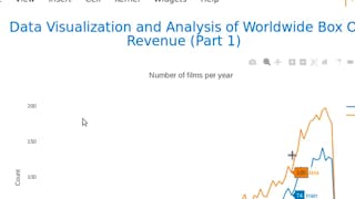
- Analyze Box Office Data with Seaborn and Python: Coursera
- Data Visualization with Python: IBM
- AI & Python Development Megaclass: Packt
- Python Packages for Data Science: University of Colorado Boulder
- Data Visualization & Storytelling in Python: Coursera
- IBM Data Analyst Capstone Project: IBM


