Advances in technology have made it possible to store ever-increasing amounts of data. Along with this, the need to analyze data and gain actionable insight is greater than ever. You already have experience working with Microsoft® Excel® and creating basic PivotTables to summarize data. But Excel is capable of doing much more. Being able to harness the power of advanced PivotTable features and create PivotCharts will help you to gain a competitive edge. You will not only be able to summarize data for you to analyze, but also organize the data in a way that can be meaningfully presented to others. This leads to data-driven business decisions that have a better chance for success for everyone involved.
Microsoft Excel: Data Analysis with PivotTables
Microsoft Excel: Data Analysis with PivotTables
This course is part of Microsoft Excel 365: From Zero to Mastery Specialization

Instructor: Bill Rosenthal
Access provided by Interbank
Gain insight into a topic and learn the fundamentals.
4 hours to complete
Flexible schedule
Learn at your own pace
What you'll learn
Connect and combine multiple data sources, including logs, external databases, and the Excel Data Model into a single, clean reporting structure.
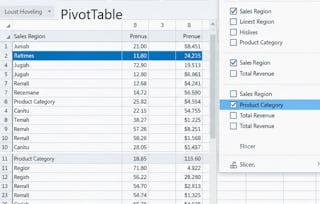
Deep-dive into metrics using advanced analysis tools like calculated fields, custom "Show Values As" summaries, Slicers, and interactive Timelines.
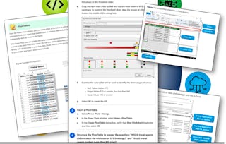
Build interactive PivotCharts and polished, formatted summaries to turn complex, raw data into clear visual stories for stakeholder decision-making.
Learn by doing. Perform guided, step-by-step hands-on activities on your own computer.
Skills you'll gain
Tools you'll learn
Details to know

Shareable certificate
Add to your LinkedIn profile
Assessments
1 assignment
Taught in English
Recently updated!
January 2026
See how employees at top companies are mastering in-demand skills

Build your subject-matter expertise
This course is part of the Microsoft Excel 365: From Zero to Mastery Specialization
When you enroll in this course, you'll also be enrolled in this Specialization.
- Learn new concepts from industry experts
- Gain a foundational understanding of a subject or tool
- Develop job-relevant skills with hands-on projects
- Earn a shareable career certificate

There are 4 modules in this course
Earn a career certificate
Add this credential to your LinkedIn profile, resume, or CV. Share it on social media and in your performance review.
Instructor
Offered by
Why people choose Coursera for their career

Felipe M.
Learner since 2018
"To be able to take courses at my own pace and rhythm has been an amazing experience. I can learn whenever it fits my schedule and mood."

Jennifer J.
Learner since 2020
"I directly applied the concepts and skills I learned from my courses to an exciting new project at work."

Larry W.
Learner since 2021
"When I need courses on topics that my university doesn't offer, Coursera is one of the best places to go."

Chaitanya A.
"Learning isn't just about being better at your job: it's so much more than that. Coursera allows me to learn without limits."