• For Individuals
  • For Businesses
  • For Universities
  • For Governments
Degrees
​
Log In
Join for Free
  • Browse
  • Visualization Chart

Results for "visualization chart"


  • Status: New
    New
    Status: Free Trial
    Free Trial
    E

    EDUCBA

    Mastering Data Visualization with Matplotlib

    Skills you'll gain: Matplotlib, Data Storytelling, Data Presentation, Data Visualization, Plot (Graphics), Scientific Visualization, Data Visualization Software, Scatter Plots, Image Quality, NumPy, Histogram, Image Analysis

    4.5
    Rating, 4.5 out of 5 stars
    ·
    13 reviews

    Mixed · Course · 1 - 4 Weeks

  • C

    Coursera

    Presenting Data Using Charts with Canva

    Skills you'll gain: Presentations, Sales Presentations, Sales Presentation, Data Visualization, Productivity Software, Design

    4.3
    Rating, 4.3 out of 5 stars
    ·
    16 reviews

    Beginner · Guided Project · Less Than 2 Hours

  • Status: Free Trial
    Free Trial
    J

    Johns Hopkins University

    Foundations of Data Visualization

    Skills you'll gain: Data Presentation, Graphic and Visual Design, Data Storytelling, Design Elements And Principles, Plot (Graphics), Data Literacy, Exploratory Data Analysis, Scatter Plots

    Intermediate · Course · 1 - 3 Months

  • C

    Coursera

    Data Visualization with Plotly Express

    Skills you'll gain: Plotly, Interactive Data Visualization, Data Visualization Software, Scatter Plots, Ggplot2, Data Analysis, Python Programming, Data Science, Machine Learning

    4.7
    Rating, 4.7 out of 5 stars
    ·
    269 reviews

    Intermediate · Guided Project · Less Than 2 Hours

  • C

    Coursera

    Python for Data Visualization:Matplotlib & Seaborn(Enhanced)

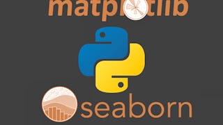
    Skills you'll gain: Matplotlib, Seaborn, Plot (Graphics), Scatter Plots, Histogram, Data Visualization, Data Visualization Software, Statistical Visualization, Data Analysis, Python Programming

    4.5
    Rating, 4.5 out of 5 stars
    ·
    30 reviews

    Beginner · Guided Project · Less Than 2 Hours

  • C

    Coursera

    Crash Course on Interactive Data Visualization with Plotly

    Skills you'll gain: Plotly, Histogram, Interactive Data Visualization, Scatter Plots, Plot (Graphics), Data Visualization, Data Analysis, Python Programming

    4.8
    Rating, 4.8 out of 5 stars
    ·
    10 reviews

    Beginner · Guided Project · Less Than 2 Hours

  • Status: New
    New
    Status: Free Trial
    Free Trial
    E

    EDUCBA

    Seaborn with Python: Data Visualization for Beginners

    Skills you'll gain: Seaborn, Data Literacy, Plot (Graphics), Matplotlib, Scatter Plots, Statistical Visualization, Data Presentation, Data Visualization Software, Box Plots, Descriptive Statistics, Exploratory Data Analysis, Statistical Analysis, Pandas (Python Package), NumPy

    4.3
    Rating, 4.3 out of 5 stars
    ·
    7 reviews

    Mixed · Course · 1 - 4 Weeks

  • C

    Coursera

    Data Visualization using Plotnine and ggplot

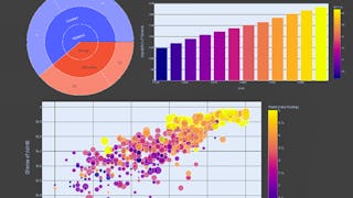
    Skills you'll gain: Exploratory Data Analysis, Box Plots, Plot (Graphics), Data Visualization, Ggplot2, Data Visualization Software, Statistical Visualization, Scatter Plots, Histogram, Graphing, Python Programming

    4.6
    Rating, 4.6 out of 5 stars
    ·
    16 reviews

    Intermediate · Guided Project · Less Than 2 Hours

  • C

    Coursera

    Create a Gantt Chart with Lucidchart

    Skills you'll gain: Timelines, Project Schedules, Scheduling, Project Management, Project Management Software, Project Planning, Project Documentation, Dependency Analysis

    Beginner · Guided Project · Less Than 2 Hours

  • C

    Coursera

    Choisir la Meilleure Méthode pour Illustrer les Données

    Skills you'll gain: Interactive Data Visualization, Heat Maps, Data Visualization, Data Visualization Software, Matplotlib, Plotly, Data Storytelling, Data Access, Correlation Analysis, Scatter Plots, Exploratory Data Analysis, Data Preprocessing, Data Science, Data Analysis, Python Programming

    4.4
    Rating, 4.4 out of 5 stars
    ·
    10 reviews

    Beginner · Guided Project · Less Than 2 Hours

  • C

    Coursera

    Data Visualization using Bokeh

    Skills you'll gain: Spatial Data Analysis, Data Visualization Software, Data Visualization, Geospatial Mapping, Geospatial Information and Technology, Interactive Data Visualization, Scatter Plots, Software Installation, Python Programming

    4.1
    Rating, 4.1 out of 5 stars
    ·
    15 reviews

    Intermediate · Guided Project · Less Than 2 Hours

  • C

    Coursera

    Data Visualization & Storytelling in Python

    Skills you'll gain: Data Storytelling, Plotly, Data Presentation, Matplotlib, Interactive Data Visualization, Seaborn, Data Visualization, Data Visualization Software, Statistical Visualization, Scatter Plots

    4.9
    Rating, 4.9 out of 5 stars
    ·
    9 reviews

    Beginner · Guided Project · Less Than 2 Hours

1…8910…157

In summary, here are 10 of our most popular visualization chart courses

  • Mastering Data Visualization with Matplotlib: EDUCBA
  • Presenting Data Using Charts with Canva: Coursera
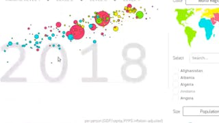
  • Foundations of Data Visualization: Johns Hopkins University
  • Data Visualization with Plotly Express: Coursera
  • Python for Data Visualization:Matplotlib & Seaborn(Enhanced): Coursera
  • Crash Course on Interactive Data Visualization with Plotly: Coursera
  • Seaborn with Python: Data Visualization for Beginners: EDUCBA
  • Data Visualization using Plotnine and ggplot: Coursera
  • Create a Gantt Chart with Lucidchart: Coursera
  • Choisir la Meilleure Méthode pour Illustrer les Données: Coursera

Other topics to explore

Arts and Humanities
338 courses
Business
1095 courses
Computer Science
668 courses
Data Science
425 courses
Information Technology
145 courses
Health
471 courses
Math and Logic
70 courses
Personal Development
137 courses
Physical Science and Engineering
413 courses
Social Sciences
401 courses
Language Learning
150 courses

Coursera Footer

Skills

  • Artificial Intelligence (AI)
  • Cybersecurity
  • Data Analytics
  • Digital Marketing
  • English Speaking
  • Generative AI (GenAI)
  • Microsoft Excel
  • Microsoft Power BI
  • Project Management
  • Python

Certificates & Programs

  • Google Cybersecurity Certificate
  • Google Data Analytics Certificate
  • Google IT Support Certificate
  • Google Project Management Certificate
  • Google UX Design Certificate
  • IBM Data Analyst Certificate
  • IBM Data Science Certificate
  • Machine Learning Certificate
  • Microsoft Power BI Data Analyst Certificate
  • UI / UX Design Certificate

Industries & Careers

  • Business
  • Computer Science
  • Data Science
  • Education & Teaching
  • Engineering
  • Finance
  • Healthcare
  • Human Resources (HR)
  • Information Technology (IT)
  • Marketing

Career Resources

  • Career Aptitude Test
  • Examples of Strengths and Weaknesses for Job Interviews
  • High-Income Skills to Learn
  • How Does Cryptocurrency Work?
  • How to Highlight Duplicates in Google Sheets
  • How to Learn Artificial Intelligence
  • Popular Cybersecurity Certifications
  • Preparing for the PMP Certification
  • Signs You Will Get the Job After an Interview
  • What Is Artificial Intelligence?

Coursera

  • About
  • What We Offer
  • Leadership
  • Careers
  • Catalog
  • Coursera Plus
  • Professional Certificates
  • MasterTrack® Certificates
  • Degrees
  • For Enterprise
  • For Government
  • For Campus
  • Become a Partner
  • Social Impact
  • Free Courses
  • Share your Coursera learning story

Community

  • Learners
  • Partners
  • Beta Testers
  • Blog
  • The Coursera Podcast
  • Tech Blog

More

  • Press
  • Investors
  • Terms
  • Privacy
  • Help
  • Accessibility
  • Contact
  • Articles
  • Directory
  • Affiliates
  • Modern Slavery Statement
  • Do Not Sell/Share
Learn Anywhere
Download on the App Store
Get it on Google Play
Logo of Certified B Corporation
© 2026 Coursera Inc. All rights reserved.
  • Coursera Facebook
  • Coursera Linkedin
  • Coursera Twitter
  • Coursera YouTube
  • Coursera Instagram
  • Coursera TikTok