• For Individuals
  • For Businesses
  • For Universities
  • For Governments
Degrees
Log In
Join for Free
  • Browse
  • Creating Maps And Visualizations Using Gis Software For Engineering Applications


Results for "creating maps and visualizations using gis software for engineering applications"


  • C

    Coursera

    Product Development using AutoCAD

    Skills you'll gain: Computer-Aided Design, AutoCAD, Drafting and Engineering Design, Product Design, Product Development, Technical Drawing, Design

    4.5
    Rating, 4.5 out of 5 stars
    ·
    169 reviews

    Beginner · Guided Project · Less Than 2 Hours

  • C

    Coursera

    Interactive Statistical Data Visualization 101

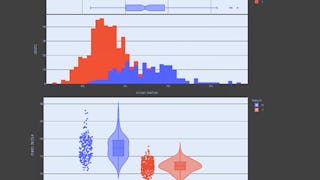
    Skills you'll gain: Plotly, Plot (Graphics), Data Visualization, Statistical Visualization, Box Plots, Scatter Plots, Interactive Data Visualization, Data Visualization Software, Histogram, Statistical Analysis, Data Analysis, Probability

    4.9
    Rating, 4.9 out of 5 stars
    ·
    10 reviews

    Beginner · Guided Project · Less Than 2 Hours

  • Status: Free Trial
    Free Trial
    L

    L&T EduTech

    BIM Fundamentals for Engineers

    Skills you'll gain: Autodesk Revit, Building Information Modeling, Engineering Documentation, Architectural Design, 3D Modeling, Facility Management, Civil Engineering, Structural Engineering, Technical Standard, HVAC, Visualization (Computer Graphics), Electrical Systems, Plumbing, User Interface (UI), File Management

    4.6
    Rating, 4.6 out of 5 stars
    ·
    102 reviews

    Intermediate · Course · 1 - 3 Months

  • Status: Free Trial
    Free Trial
    A

    Arizona State University

    Using Rapid Prototyping in the Engineering Design Process

    Skills you'll gain: Engineering Design Process, Engineering Drawings, Prototyping, Drafting and Engineering Design, Mechanical Drawings, Computer-Aided Design, Technical Drawing, Robotics

    4.8
    Rating, 4.8 out of 5 stars
    ·
    29 reviews

    Beginner · Course · 1 - 4 Weeks

  • C

    Coursera

    Data Visualization using Microsoft Excel

    Skills you'll gain: Data Visualization, Microsoft Excel, Data Visualization Software, Data Import/Export, Business Reporting, Report Writing, Microsoft 365

    4.5
    Rating, 4.5 out of 5 stars
    ·
    65 reviews

    Beginner · Guided Project · Less Than 2 Hours

  • C

    Coursera

    Python for Data Visualization:Matplotlib & Seaborn(Enhanced)

    Skills you'll gain: Matplotlib, Seaborn, Plot (Graphics), Scatter Plots, Histogram, Data Visualization, Data Visualization Software, Statistical Visualization, Data Analysis, Python Programming

    4.5
    Rating, 4.5 out of 5 stars
    ·
    30 reviews

    Beginner · Guided Project · Less Than 2 Hours

  • C

    Coursera

    Create IT Diagrams with Lucidchart

    Skills you'll gain: Diagram Design, Data Import/Export, Collaborative Software, Technical Documentation, User Accounts

    4.8
    Rating, 4.8 out of 5 stars
    ·
    30 reviews

    Beginner · Guided Project · Less Than 2 Hours

  • C

    Coursera

    Python for Data Visualization: Matplotlib & Seaborn

    Skills you'll gain: Matplotlib, Histogram, Plot (Graphics), Data Visualization, Seaborn, Scatter Plots, Data Visualization Software, Statistical Visualization, Graphing, Python Programming

    4.6
    Rating, 4.6 out of 5 stars
    ·
    76 reviews

    Beginner · Guided Project · Less Than 2 Hours

  • Status: Free Trial
    Free Trial
    D

    Duke University

    Data Visualization and Modeling in Python

    Skills you'll gain: Matplotlib, Data Visualization, Predictive Modeling, Pandas (Python Package), Data Visualization Software, Predictive Analytics, Regression Analysis, Data Analysis, Data Cleansing, Data Science, Machine Learning Algorithms, Statistical Inference, Statistical Modeling, Probability & Statistics, Classification Algorithms, Python Programming

    Intermediate · Course · 1 - 4 Weeks

  • C

    Coursera

    Data Visualization with Plotly Express

    Skills you'll gain: Plotly, Interactive Data Visualization, Data Visualization Software, Scatter Plots, Ggplot2, Data Analysis, Python Programming, Data Science, Machine Learning

    4.7
    Rating, 4.7 out of 5 stars
    ·
    269 reviews

    Intermediate · Guided Project · Less Than 2 Hours

  • C

    Coursera

    Build a Website Map with Jumpchart

    Skills you'll gain: Wireframing, Mockups, Web Content, Web Design, Information Architecture, Collaborative Software, User Experience Design

    Beginner · Guided Project · Less Than 2 Hours

  • Status: New
    New
    Status: Free Trial
    Free Trial
    E

    EDUCBA

    Advanced Matplotlib: Design & Customize Visualizations

    Skills you'll gain: Matplotlib, Plot (Graphics), Scientific Visualization, Data Visualization, Data Presentation

    Mixed · Course · 1 - 4 Weeks

1…8910…834

In summary, here are 10 of our most popular creating maps and visualizations using gis software for engineering applications courses

  • Product Development using AutoCAD: Coursera
  • Interactive Statistical Data Visualization 101: Coursera
  • BIM Fundamentals for Engineers: L&T EduTech
  • Using Rapid Prototyping in the Engineering Design Process: Arizona State University
  • Data Visualization using Microsoft Excel: Coursera
  • Python for Data Visualization:Matplotlib & Seaborn(Enhanced): Coursera
  • Create IT Diagrams with Lucidchart: Coursera
  • Python for Data Visualization: Matplotlib & Seaborn: Coursera
  • Data Visualization and Modeling in Python: Duke University
  • Data Visualization with Plotly Express: Coursera

Other topics to explore

Arts and Humanities
338 courses
Business
1095 courses
Computer Science
668 courses
Data Science
425 courses
Information Technology
145 courses
Health
471 courses
Math and Logic
70 courses
Personal Development
137 courses
Physical Science and Engineering
413 courses
Social Sciences
401 courses
Language Learning
150 courses

Coursera Footer

Skills

  • Artificial Intelligence (AI)
  • Cybersecurity
  • Data Analytics
  • Digital Marketing
  • English Speaking
  • Generative AI (GenAI)
  • Microsoft Excel
  • Microsoft Power BI
  • Project Management
  • Python

Certificates & Programs

  • Google Cybersecurity Certificate
  • Google Data Analytics Certificate
  • Google IT Support Certificate
  • Google Project Management Certificate
  • Google UX Design Certificate
  • IBM Data Analyst Certificate
  • IBM Data Science Certificate
  • Machine Learning Certificate
  • Microsoft Power BI Data Analyst Certificate
  • UI / UX Design Certificate

Industries & Careers

  • Business
  • Computer Science
  • Data Science
  • Education & Teaching
  • Engineering
  • Finance
  • Healthcare
  • Human Resources (HR)
  • Information Technology (IT)
  • Marketing

Career Resources

  • Career Aptitude Test
  • Examples of Strengths and Weaknesses for Job Interviews
  • High-Income Skills to Learn
  • How Does Cryptocurrency Work?
  • How to Highlight Duplicates in Google Sheets
  • How to Learn Artificial Intelligence
  • Popular Cybersecurity Certifications
  • Preparing for the PMP Certification
  • Signs You Will Get the Job After an Interview
  • What Is Artificial Intelligence?

Coursera

  • About
  • What We Offer
  • Leadership
  • Careers
  • Catalog
  • Coursera Plus
  • Professional Certificates
  • MasterTrack® Certificates
  • Degrees
  • For Enterprise
  • For Government
  • For Campus
  • Become a Partner
  • Social Impact
  • Free Courses
  • Share your Coursera learning story

Community

  • Learners
  • Partners
  • Beta Testers
  • Blog
  • The Coursera Podcast
  • Tech Blog

More

  • Press
  • Investors
  • Terms
  • Privacy
  • Help
  • Accessibility
  • Contact
  • Articles
  • Directory
  • Affiliates
  • Modern Slavery Statement
  • Do Not Sell/Share
Learn Anywhere
Download on the App Store
Get it on Google Play
Logo of Certified B Corporation
© 2025 Coursera Inc. All rights reserved.
  • Coursera Facebook
  • Coursera Linkedin
  • Coursera Twitter
  • Coursera YouTube
  • Coursera Instagram
  • Coursera TikTok