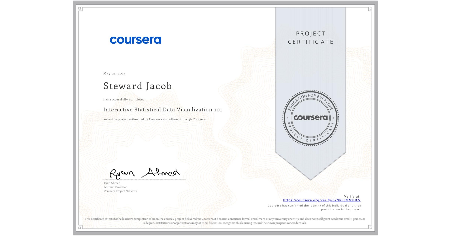
Interactive Statistical Data Visualization 101
Completed by Steward Jacob
May 21, 2025
2 hours (approximately)
Steward Jacob's account is verified. Coursera certifies their successful completion of Interactive Statistical Data Visualization 101

What you will learn
Understand how to generate interactive statistical plots such as box plots, histograms, density map, scatter matrix, violin plot, and contour plots
Understand python programming fundamentals for interactive data visualization
Leverage the power of Plotly to generate interactive plots
Skills you will gain
- Category: Histogram
- Category: Statistical Visualization
- Category: Interactive Data Visualization
- Category: Data Visualization
- Category: Statistical Analysis
- Category: Box Plots
- Category: Data Analysis
- Category: Probability
- Category: Plotly