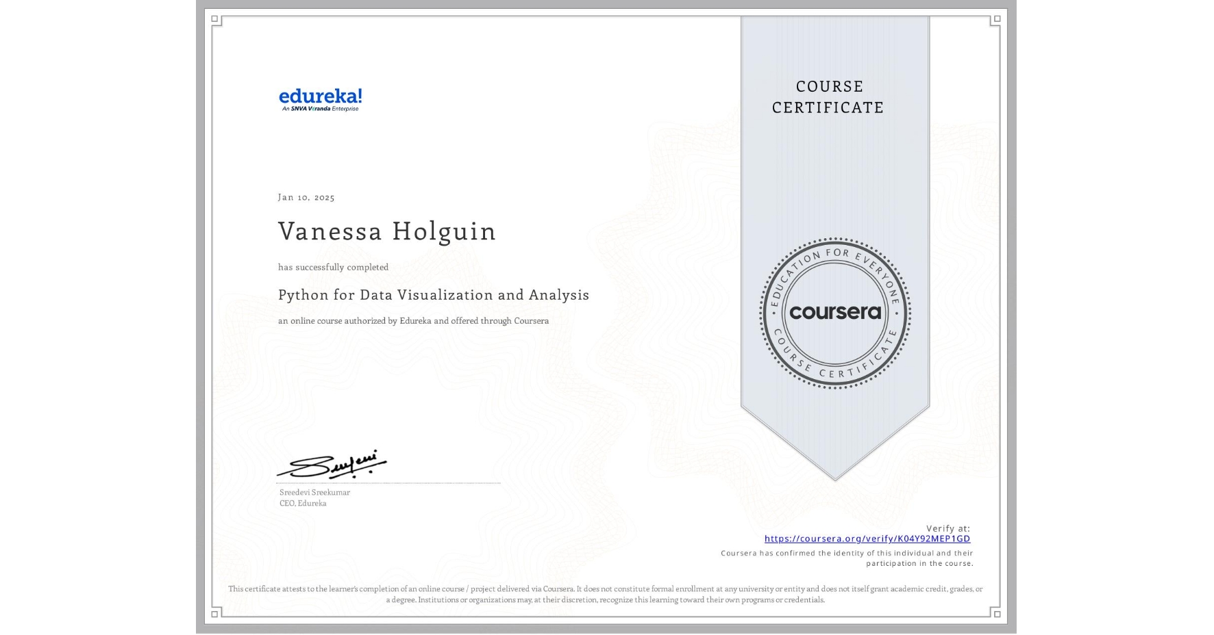
Python for Data Visualization and Analysis
Completed by Vanessa Holguin
January 10, 2025
9 hours (approximately)
Vanessa Holguin's account is verified. Coursera certifies their successful completion of Python for Data Visualization and Analysis

What you will learn
Create impactful visualizations using Matplotlib and Seaborn to represent complex datasets effectively.
Build dynamic, interactive charts and dashboards with Plotly and IPyWidgets for enhanced data exploration.
Build dynamic, interactive charts and dashboards with Plotly and IPyWidgets for enhanced data exploration.
Deploy interactive data visualization applications seamlessly with Streamlit to share analysis results.
Skills you will gain
- Category: Seaborn
- Category: Dashboard Creation
- Category: Plotly
- Category: Plot (Graphics)
- Category: Data Visualization
- Category: Data Storytelling
- Category: Matplotlib
- Category: Exploratory Data Analysis
- Category: Data Presentation