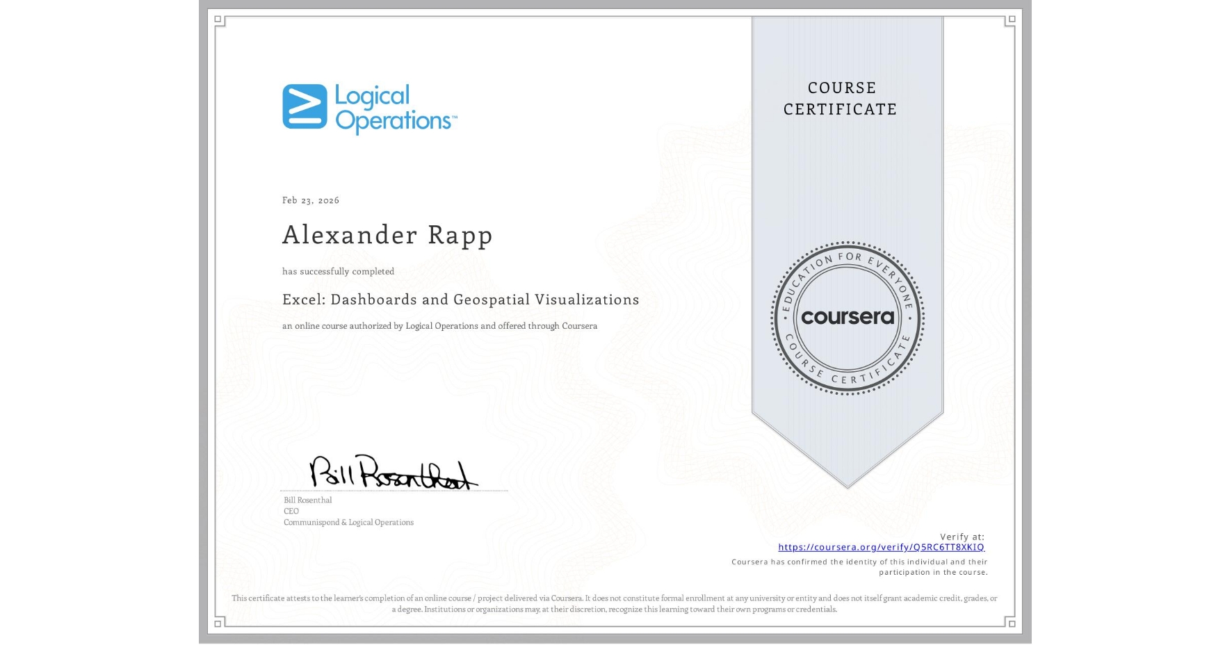
Excel: Dashboards and Geospatial Visualizations
Completed by Alexander Rapp
February 23, 2026
2 hours (approximately)
Alexander Rapp's account is verified. Coursera certifies their successful completion of Excel: Dashboards and Geospatial Visualizations

What you will learn
Build interactive business intelligence dashboards using dynamic PivotCharts, key performance indicators, and automated data refresh options.
Streamline report navigation by linking multi-chart views to synchronized data slicers and interactive timeline filters.
Generate advanced geospatial visualizations by integrating geographic information system data directly into custom map charts.
Data files for this course are provided in the first course of this specialization, "Excel: Data Analysis and Visualization Fundamentals".
Skills you will gain
- Category: Geospatial Information and Technology
- Category: Microsoft 365
- Category: Data Presentation
- Category: Geospatial Mapping
- Category: Data Analysis
- Category: Datamaps
- Category: Microsoft Excel
- Category: Dashboard
- Category: Data Storytelling
- Category: Data Visualization
- Category: Productivity Software
- Category: Dashboard Creation