Charting Courses
Charting courses can help you learn data visualization techniques, effective storytelling with data, and the principles of design for charts and graphs. You can build skills in interpreting complex datasets, selecting appropriate chart types, and using color and layout to enhance clarity. Many courses introduce tools like Tableau, Microsoft Excel, and Google Data Studio, that support creating impactful visual representations of data and communicating insights effectively.
Popular Charting Courses and Certifications

Skills you'll gain: Spreadsheet Software, Data Visualization, Plot (Graphics), Data Management

Skills you'll gain: Market Trend, Technical Analysis, Trend Analysis, Financial Trading, Market Dynamics, Graphing, Verification And Validation, Market Data
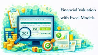
Skills you'll gain: Financial Modeling, Competitive Analysis, Business Valuation, Feasibility Studies, Project Finance, Investment Banking, Financial Analysis, Mergers & Acquisitions, Financial Forecasting, Capital Budgeting, Benchmarking, Risk Analysis, Waterfall Methodology, Excel Formulas, Cash Flows, Microsoft Excel, Cash Flow Forecasting, Finance, Business Analysis, Technical Analysis

Skills you'll gain: Market Trend, Technical Analysis, Trend Analysis, Financial Trading, Performance Analysis, Market Analysis, Forecasting, Transaction Processing, Profit and Loss (P&L) Management

University of Michigan
Skills you'll gain: Pandas (Python Package), Data Manipulation, NumPy, Data Processing, Data Cleansing, Data Wrangling, Data Transformation, Data Preprocessing, Data Science, Statistical Analysis, Data-Driven Decision-Making, Pivot Tables And Charts, Data Analysis, Statistical Methods, Python Programming, Data Import/Export, Scripting Languages, Probability & Statistics, Programming Principles, Text Mining

Skills you'll gain: Technical Analysis, Sampling (Statistics), Quantitative Research, Financial Analysis, Statistical Hypothesis Testing, Portfolio Risk, Probability, Return On Investment, Portfolio Management, Financial Data, Market Data, Statistical Analysis, Financial Market, Statistical Methods, Probability Distribution, Probability & Statistics, Market Trend, Finance, Performance Metric, Investment Management

Skills you'll gain: Technical Analysis, Market Trend, Market Dynamics, Financial Trading, Financial Market, Market Analysis, Trend Analysis, Graphing, Business

Logical Operations
Skills you'll gain: Microsoft Excel, Spreadsheet Software, Excel Formulas, Microsoft Office, Pivot Tables And Charts, Excel Macros, Data Presentation, Microsoft 365, Business Intelligence, Data Visualization Software, Productivity Software, Data Visualization, Data Integration, Data Entry, Key Performance Indicators (KPIs), Data Management, Document Management, File Management, Performance Management, User Interface (UI)
 Status: Hot New Release
Skills you'll gain: Microsoft Excel, Pivot Tables And Charts, Excel Formulas, Spreadsheet Software, Business Reporting, Data Visualization, Interactive Data Visualization, Excel Macros, Data Presentation, Dashboard, Forecasting, Dashboard Creation, Data Analysis, Data Visualization Software, Predictive Modeling, Data Validation, Data Entry, Data Management, Data Security, Data Integrity

Skills you'll gain: Technical Analysis, Market Trend, Market Data, Trend Analysis, Financial Trading, Market Analysis, Market Dynamics

Birla Institute of Technology & Science, Pilani
Skills you'll gain: Theoretical Computer Science, Computer Programming, Algorithms, Computer Science, Formal Learning, Software Engineering, Program Development, Data Science, Technical Analysis

Skills you'll gain: Technical Analysis, Market Dynamics, Market Trend, Financial Trading, Risk Management, Market Data, Trend Analysis, Risk Analysis, Securities Trading, Market Analysis, Consolidation
In summary, here are 10 of our most popular charting courses
- Excel Charts and Pivot Tables: Packt
- Trend Analysis & Chart Reading for Traders: EDUCBA
- Financial Valuation and Deal Modeling with Excel: Coursera
- Forex Trading and Binary Options Basics: EDUCBA
- Introduction to Data Science in Python: University of Michigan
- Quantitative Methods for Financial Analysis: EDUCBA
- Technical Trading Strategies & Market Analysis: EDUCBA
- Microsoft Excel 2021-2024 Mastery: Logical Operations
- Microsoft Excel Mastery: From Basics to Pro Skills: EDUCBA
- Technical Charts & Dow Theory Fundamentals: EDUCBA


