• For Individuals
  • For Businesses
  • For Universities
  • For Governments
Degrees
​
Log In
Join for Free
  • Browse
  • Creating Charts

Results for "creating charts"


  • C

    Coursera

    Create a Gantt Chart with Lucidchart

    Skills you'll gain: Timelines, Project Schedules, Scheduling, Project Management, Project Management Software, Project Planning, Project Documentation, Dependency Analysis

    Beginner · Guided Project · Less Than 2 Hours

  • Status: Free Trial
    Free Trial
    J

    Johns Hopkins University

    Building Data Visualization Tools

    Skills you'll gain: Ggplot2, Data Visualization Software, Data Visualization, Datamaps, Visualization (Computer Graphics), Interactive Data Visualization, Scatter Plots, Histogram, Graphic and Visual Design, R Programming, Geospatial Information and Technology, Geospatial Mapping

    3.9
    Rating, 3.9 out of 5 stars
    ·
    158 reviews

    Intermediate · Course · 1 - 3 Months

  • C

    Coursera

    Create an infographic with Infogram

    Skills you'll gain: Data Storytelling, Infographics, Interactive Data Visualization, Data Visualization, Storytelling, Storyboarding, Diagram Design, Data Analysis, Graphic and Visual Design

    4.9
    Rating, 4.9 out of 5 stars
    ·
    9 reviews

    Beginner · Guided Project · Less Than 2 Hours

  • C

    Coursera

    Time Series Data Visualization And Analysis Techniques

    Skills you'll gain: Time Series Analysis and Forecasting, Data Visualization, Data Visualization Software, Statistical Visualization, Data Preprocessing, Box Plots, Anomaly Detection, Heat Maps, Plotly, Exploratory Data Analysis, Python Programming

    4.4
    Rating, 4.4 out of 5 stars
    ·
    17 reviews

    Intermediate · Guided Project · Less Than 2 Hours

  • Status: New
    New
    P

    Packt

    Data Visualization in Tableau & Python (2 Courses in 1)

    Skills you'll gain: Data Visualization Software, Interactive Data Visualization, Data Storytelling, Seaborn, Tableau Software, Statistical Visualization, Dashboard, Matplotlib, Visualization (Computer Graphics), Heat Maps, Scatter Plots, Histogram

    Intermediate · Course · 1 - 3 Months

  • C

    Coursera

    Use RACI charts for work management with Asana

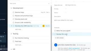
    Skills you'll gain: Cross-Functional Collaboration, Project Management Software, Workflow Management, Organizational Skills, Project Management, Prioritization

    4.7
    Rating, 4.7 out of 5 stars
    ·
    18 reviews

    Beginner · Guided Project · Less Than 2 Hours

  • C

    Coursera

    Project Management: Creating the WBS

    Skills you'll gain: Work Breakdown Structure, Project Scoping, Project Estimation, Organizational Structure, Scope Management, Project Coordination, Project Management Software, Project Management, Google Sheets, Standard Operating Procedure

    4.6
    Rating, 4.6 out of 5 stars
    ·
    553 reviews

    Beginner · Guided Project · Less Than 2 Hours

  • C

    Coursera

    RStudio for Six Sigma - Control Charts

    Skills you'll gain: Statistical Process Controls, Six Sigma Methodology, Quality Control, Plot (Graphics), Data Literacy, Statistical Analysis, R Programming

    Beginner · Guided Project · Less Than 2 Hours

  • C

    Coursera

    Create a Marketing Analysis dashboard using G-Spreadsheets

    Skills you'll gain: Dashboard, Data Visualization, Data Entry, Excel Formulas, Data Presentation, Google Sheets, Spreadsheet Software, Management Reporting, Business Reporting, Marketing Analytics, Market Analysis, Data Validation

    4.6
    Rating, 4.6 out of 5 stars
    ·
    16 reviews

    Beginner · Guided Project · Less Than 2 Hours

  • Status: Free Trial
    Free Trial
    A

    Automatic Data Processing, Inc. (ADP)

    Creating an Engaging Candidate Experience

    Skills you'll gain: Recruitment, Recruitment Strategies, Talent Acquisition, Drive Engagement, Brand Loyalty, Interviewing Skills, Brand Awareness, Employee Onboarding, Customer experience strategy (CX), Personalized Service, Relationship Building

    4.5
    Rating, 4.5 out of 5 stars
    ·
    11 reviews

    Intermediate · Course · 1 - 4 Weeks

  • C

    Coursera

    Creating Database Tables with SQL

    Skills you'll gain: Relational Databases, Database Design, Database Development, SQL, Database Management, Databases, Data Integrity

    4.6
    Rating, 4.6 out of 5 stars
    ·
    324 reviews

    Intermediate · Guided Project · Less Than 2 Hours

  • C

    Coursera

    Charts, Pictures, Themes, and Styles in Microsoft Excel

    Skills you'll gain: Microsoft Excel, Spreadsheet Software, Microsoft Office, User Accounts

    4.6
    Rating, 4.6 out of 5 stars
    ·
    17 reviews

    Beginner · Guided Project · Less Than 2 Hours

1…789…180

In summary, here are 10 of our most popular creating charts courses

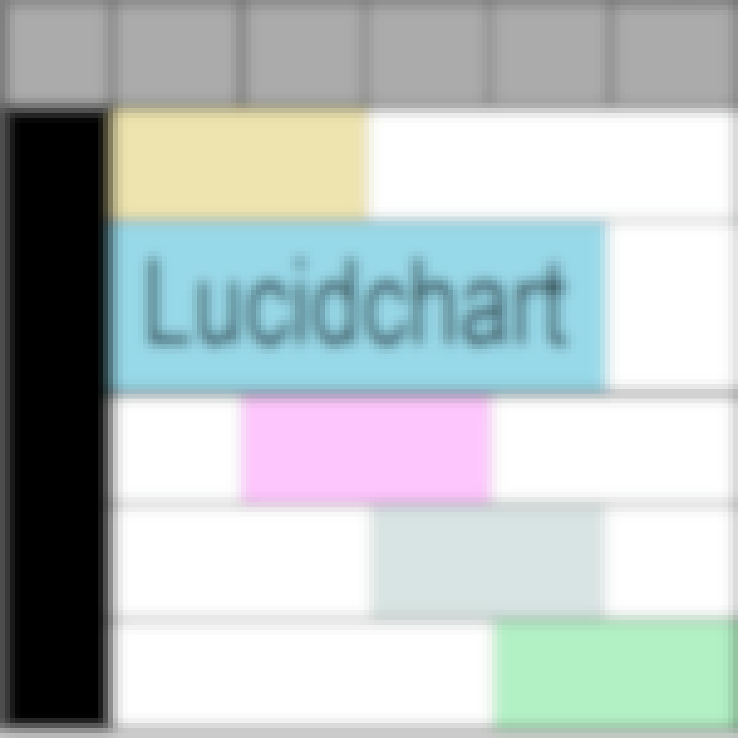
  • Create a Gantt Chart with Lucidchart: Coursera
  • Building Data Visualization Tools: Johns Hopkins University
  • Create an infographic with Infogram : Coursera
  • Time Series Data Visualization And Analysis Techniques : Coursera
  • Data Visualization in Tableau & Python (2 Courses in 1): Packt
  • Use RACI charts for work management with Asana: Coursera
  • Project Management: Creating the WBS: Coursera
  • RStudio for Six Sigma - Control Charts: Coursera
  • Create a Marketing Analysis dashboard using G-Spreadsheets: Coursera
  • Creating an Engaging Candidate Experience: Automatic Data Processing, Inc. (ADP)

Other topics to explore

Arts and Humanities
338 courses
Business
1095 courses
Computer Science
668 courses
Data Science
425 courses
Information Technology
145 courses
Health
471 courses
Math and Logic
70 courses
Personal Development
137 courses
Physical Science and Engineering
413 courses
Social Sciences
401 courses
Language Learning
150 courses

Coursera Footer

Skills

  • Artificial Intelligence (AI)
  • Cybersecurity
  • Data Analytics
  • Digital Marketing
  • English Speaking
  • Generative AI (GenAI)
  • Microsoft Excel
  • Microsoft Power BI
  • Project Management
  • Python

Certificates & Programs

  • Google Cybersecurity Certificate
  • Google Data Analytics Certificate
  • Google IT Support Certificate
  • Google Project Management Certificate
  • Google UX Design Certificate
  • IBM Data Analyst Certificate
  • IBM Data Science Certificate
  • Machine Learning Certificate
  • Microsoft Power BI Data Analyst Certificate
  • UI / UX Design Certificate

Industries & Careers

  • Business
  • Computer Science
  • Data Science
  • Education & Teaching
  • Engineering
  • Finance
  • Healthcare
  • Human Resources (HR)
  • Information Technology (IT)
  • Marketing

Career Resources

  • Career Aptitude Test
  • Examples of Strengths and Weaknesses for Job Interviews
  • High-Income Skills to Learn
  • How Does Cryptocurrency Work?
  • How to Highlight Duplicates in Google Sheets
  • How to Learn Artificial Intelligence
  • Popular Cybersecurity Certifications
  • Preparing for the PMP Certification
  • Signs You Will Get the Job After an Interview
  • What Is Artificial Intelligence?

Coursera

  • About
  • What We Offer
  • Leadership
  • Careers
  • Catalog
  • Coursera Plus
  • Professional Certificates
  • MasterTrack® Certificates
  • Degrees
  • For Enterprise
  • For Government
  • For Campus
  • Become a Partner
  • Social Impact
  • Free Courses
  • Share your Coursera learning story

Community

  • Learners
  • Partners
  • Beta Testers
  • Blog
  • The Coursera Podcast
  • Tech Blog

More

  • Press
  • Investors
  • Terms
  • Privacy
  • Help
  • Accessibility
  • Contact
  • Articles
  • Directory
  • Affiliates
  • Modern Slavery Statement
  • Do Not Sell/Share
Learn Anywhere
Download on the App Store
Get it on Google Play
Logo of Certified B Corporation
© 2026 Coursera Inc. All rights reserved.
  • Coursera Facebook
  • Coursera Linkedin
  • Coursera Twitter
  • Coursera YouTube
  • Coursera Instagram
  • Coursera TikTok