5.0
Reviewed Jan 16, 2026It was a great hands on learning project. I highly recommmend for those looking to practice on real world data appliation or refreshing their skills. Thanks to the course team and coursera.
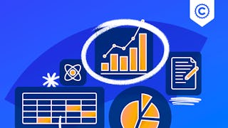
In this hands-on project, we will understand the fundamentals of data visualization with Python and leverage the power of two important python libraries known as Matplotlib and seaborn. We will learn how to generate line plots, scatterplots, histograms, distribution plot, 3D plots, pie charts, pair plots, countplots and many more! Note: This course works best for learners who are based in the North America region. We’re currently working on providing the same experience in other regions.
It was a great hands on learning project. I highly recommmend for those looking to practice on real world data appliation or refreshing their skills. Thanks to the course team and coursera.
In one word superb overview and explanation.And I loved mini challenges idea
Great instructor and project. The third one with this instructor, will definitely be taking more.