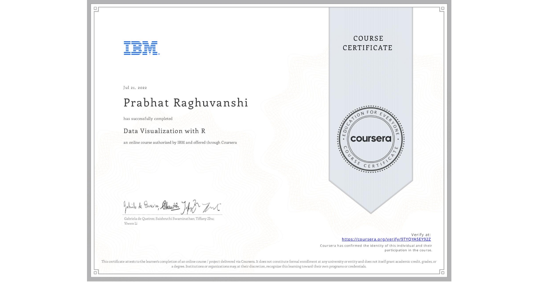
Data Visualization with R
Completed by Prabhat Raghuvanshi
July 21, 2022
12 hours (approximately)
Prabhat Raghuvanshi's account is verified. Coursera certifies their successful completion of Data Visualization with R

What you will learn
Create bar charts, histograms, pie charts, scatter plots, line graphs, box plots, and maps using R and related packages.
Design customized charts and plots using annotations, axis titles, text labels, themes, and faceting.
Create maps using the Leaflet package for R.
Create interactive dashboards using the Shiny package for R.
Skills you will gain
- Category: Statistical Visualization
- Category: Box Plots
- Category: Data Presentation
- Category: Dashboard
- Category: Plot (Graphics)
- Category: R Programming
- Category: Interactive Data Visualization
- Category: Leaflet (Software)
- Category: Ggplot2
- Category: Data Analysis
- Category: Rmarkdown
- Category: Data Visualization Software