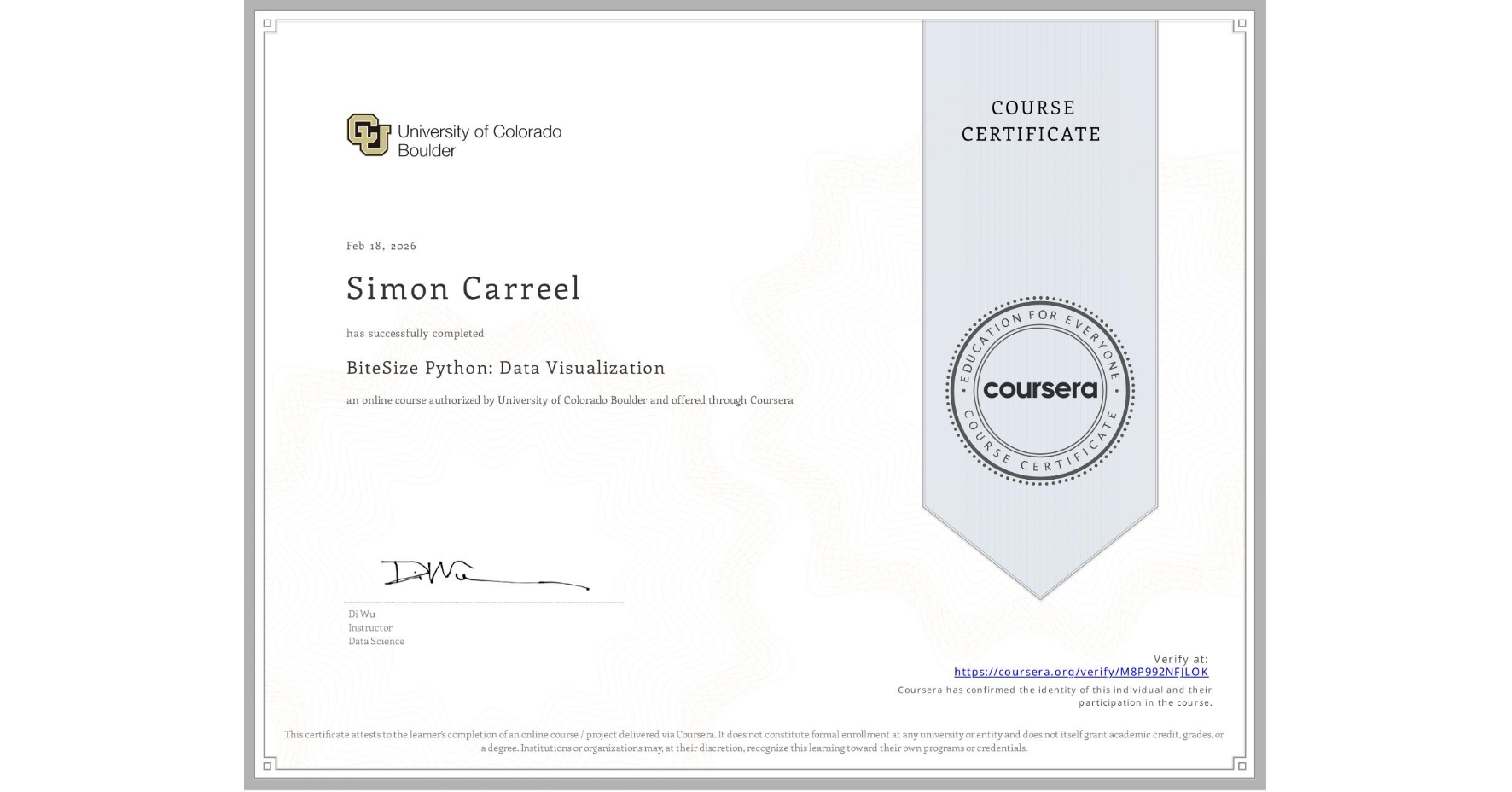
BiteSize Python: Data Visualization
Completed by Simon Carreel
February 18, 2026
17 hours (approximately)
Simon Carreel's account is verified. Coursera certifies their successful completion of BiteSize Python: Data Visualization

What you will learn
Identify the strengths and differences between Matplotlib, Seaborn, and Plotly for various visualization needs.
Create a wide range of plots, including line, bar, scatter, and pie charts, using each of the three packages.
Apply data visualization techniques to real-world data, gaining deeper insights into how to use these tools for storytelling and communication.
Skills you will gain
- Category: Seaborn
- Category: Heat Maps
- Category: Statistical Visualization
- Category: Interactive Data Visualization
- Category: Plotly
- Category: Matplotlib
- Category: Plot (Graphics)
- Category: Data Analysis
- Category: Scatter Plots
- Category: Data Visualization Software
- Category: Data Visualization
- Category: Data Presentation