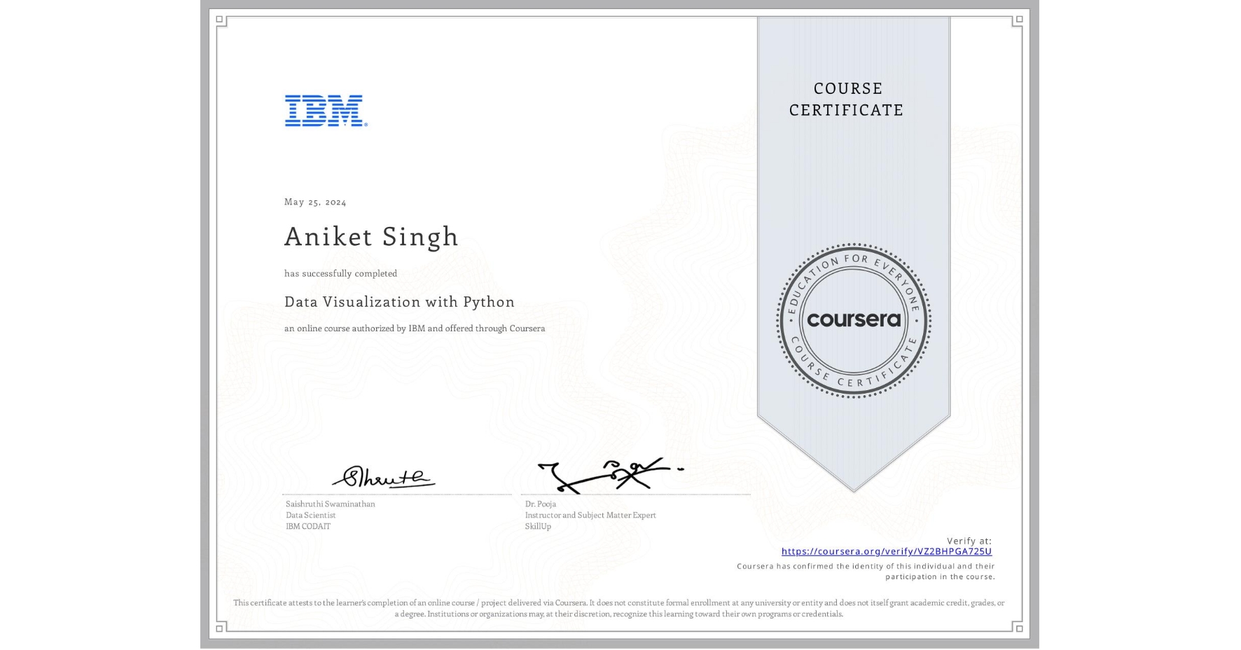
Data Visualization with Python
Completed by Aniket Singh
May 25, 2024
18 hours (approximately)
Aniket Singh's account is verified. Coursera certifies their successful completion of Data Visualization with Python

What you will learn
Implement data visualization techniques and plots using Python libraries, such as Matplotlib, Seaborn, and Folium to tell a stimulating story
Create different types of charts and plots such as line, area, histograms, bar, pie, box, scatter, and bubble
Create advanced visualizations such as waffle charts, word clouds, regression plots, maps with markers, & choropleth maps
Generate interactive dashboards containing scatter, line, bar, bubble, pie, and sunburst charts using the Dash framework and Plotly library
Skills you will gain
- Category: Spatial Data Analysis
- Category: Plotly
- Category: Matplotlib
- Category: Data Presentation
- Category: Data Visualization
- Category: Data Visualization Software
- Category: Data Analysis
- Category: Interactive Data Visualization
- Category: Dashboard Creation
- Category: Python Programming
- Category: Data Storytelling
- Category: Histogram