WJ
Reviewed Jan 16, 2026
It was a great hands on learning project. I highly recommmend for those looking to practice on real world data appliation or refreshing their skills. Thanks to the course team and coursera.
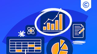
In this hands-on project, we will understand the fundamentals of data visualization with Python and leverage the power of two important python libraries known as Matplotlib and seaborn. We will learn how to generate line plots, scatterplots, histograms, distribution plot, 3D plots, pie charts, pair plots, countplots and many more! Note: This course works best for learners who are based in the North America region. We’re currently working on providing the same experience in other regions.
WJ
It was a great hands on learning project. I highly recommmend for those looking to practice on real world data appliation or refreshing their skills. Thanks to the course team and coursera.
MA
In one word superb overview and explanation.And I loved mini challenges idea
NS
Great instructor and project. The third one with this instructor, will definitely be taking more.
Showing: 20 of 21
First: Please know that this project does NOT have a resource section where you can download what you have done - so - you need to copy paste the code for reference (or you can always come back and revisit later if you have a subscription).
This course is too basic - but gives you a good idea of what to do. Seaborn and 3D plot is just brushed at the surface - so if you are here for these - better read the contents section.
I wanted to understand how to make surface maps and contour maps - but these were hardly touched.
Instructor is good and has clear pronunciation - so please do not take this review as any point towards the instructor. The structure is very basic - but it is a breat place to begin if someone is new to graphs.
The instructor and the videos are clear and concise, for anyone who has basic to intermediate understanding of coding in Python, but wants to apply it more to data analysis, I fully recommend this course.
It was a great hands on learning project. I highly recommmend for those looking to practice on real world data appliation or refreshing their skills. Thanks to the course team and coursera.
I liked the concise (not replete) course delivery. I would suggest thought that the exercises be conducted using Colab instead of the built-in Ryder.
Great instructor and project. The third one with this instructor, will definitely be taking more.
In one word superb overview and explanation.And I loved mini challenges idea
Muy bueno para iniciar, aunque no sepas inglés se entiende muy bien.
It is so useful and very well structured and explained.
Very clear, but also very surface-level
very informative course for beginners
Very basic but very clear.
Excellent. I learnt a lot.
UGIKFHYKUFUKTU
War sehr gut!
Awesome
nice
good
challenging but interesting
That was Good
good course