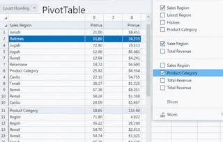
Master Excel Pivot Tables to analyze, summarize, and visualize large datasets efficiently. Learn how to transform raw data into meaningful business insights using dynamic reports, Pivot Charts, and automated reporting techniques.

Excel Pivot Table Analysis & Visualization

Excel Pivot Table Analysis & Visualization
This course is part of Advanced Excel Tools for Data Analysis Specialization

Instructor: EDUCBA
Access provided by George Mason University
Gain insight into a topic and learn the fundamentals.
11 reviews
4 hours to complete
Flexible schedule
Learn at your own pace
What you'll learn
Create and manage Pivot Tables for dynamic data analysis.
Build Pivot Charts and automated reports for business insights.
Analyze large datasets using filters, calculations, and reporting tools.
Skills you'll gain
- Performance Reporting
- Statistical Reporting
- Business Analytics
- Pivot Tables And Charts
- Data Manipulation
- Analytics
- Operational Efficiency
- Analytical Skills
- Excel Formulas
- Data Presentation
- Data Storytelling
- Data Analysis
- Data Synthesis
- Data Compilation
- Ad Hoc Reporting
- Spreadsheet Software
- Scalability
- Data Visualization
Tools you'll learn
Details to know

Shareable certificate
Add to your LinkedIn profile
Assessments
6 assignments
Taught in English
Recently updated!
May 2026
See how employees at top companies are mastering in-demand skills

Build your subject-matter expertise
This course is part of the Advanced Excel Tools for Data Analysis Specialization
When you enroll in this course, you'll also be enrolled in this Specialization.
- Learn new concepts from industry experts
- Gain a foundational understanding of a subject or tool
- Develop job-relevant skills with hands-on projects
- Earn a shareable career certificate


Why people choose Coursera for their career

Felipe M.
Learner since 2018
"To be able to take courses at my own pace and rhythm has been an amazing experience. I can learn whenever it fits my schedule and mood."

Jennifer J.
Learner since 2020
"I directly applied the concepts and skills I learned from my courses to an exciting new project at work."

Larry W.
Learner since 2021
"When I need courses on topics that my university doesn't offer, Coursera is one of the best places to go."

Chaitanya A.
"Learning isn't just about being better at your job: it's so much more than that. Coursera allows me to learn without limits."
Learner reviews
- 5 stars
76.92%
- 4 stars
15.38%
- 3 stars
0%
- 2 stars
7.69%
- 1 star
0%
Showing 3 of 11
PD
Reviewed on Aug 4, 2026
I completed this course with a much better understanding than I expected.
LY
Reviewed on Aug 10, 2026
Every chapter added value and kept me motivated to continue. I finished the course feeling accomplished.
AS
Reviewed on Aug 2, 2026
I wasn't sure what to expect, but this course completely surprised me with its quality. It kept me interested from the first lesson to the last.