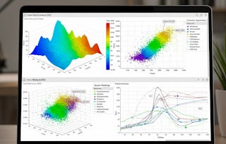
This comprehensive course equips learners with the skills to create, customize, and evaluate high-quality visualizations using Python’s Matplotlib library. Beginning with foundational plotting concepts, learners will identify key Matplotlib components, construct simple and multi-axis plots, and apply labeling, scaling, and annotation techniques to effectively convey data insights.
Mastering Data Visualization with Matplotlib
Mastering Data Visualization with Matplotlib
This course is part of Matplotlib: Python Data Visualization & Wrangling Specialization
Instructor: EDUCBA
Access provided by Hertz
Gain insight into a topic and learn the fundamentals.
15 reviews
7 hours to complete
Flexible schedule
Learn at your own pace
What you'll learn
Construct simple and multi-axis plots with labels, scaling, and annotations.
Design specialized charts including polar plots, streamplots, and pie charts.
Customize styles, axes, and figures to produce publication-ready visuals.
Skills you'll gain
Tools you'll learn
Details to know

Shareable certificate
Add to your LinkedIn profile
Assessments
8 assignments
Taught in English
See how employees at top companies are mastering in-demand skills

Build your subject-matter expertise
This course is part of the Matplotlib: Python Data Visualization & Wrangling Specialization
When you enroll in this course, you'll also be enrolled in this Specialization.
- Learn new concepts from industry experts
- Gain a foundational understanding of a subject or tool
- Develop job-relevant skills with hands-on projects
- Earn a shareable career certificate

There are 2 modules in this course
This module introduces learners to the essential concepts and workflows of creating visualizations using Matplotlib. It covers the installation and setup of Python and Matplotlib, fundamental plotting commands, customization of simple plots, and managing figures and axes. Learners will develop the foundational skills necessary to create, modify, and interpret basic line graphs, preparing them for more advanced data visualization techniques.
What's included
12 videos4 assignments
This module builds on foundational Matplotlib skills by exploring advanced chart types, specialized visuals, and customization techniques. Learners will work with complex plot elements such as custom line patterns, pseudocolor meshes, streamplots, ellipses, polar charts, and pie charts. They will also apply advanced styling to images, plots, and figure outputs using Matplotlib’s customization tools and style sheets, enabling them to produce visually refined, publication-ready visualizations.
What's included
15 videos4 assignments
Earn a career certificate
Add this credential to your LinkedIn profile, resume, or CV. Share it on social media and in your performance review.
Why people choose Coursera for their career

Felipe M.
Learner since 2018
"To be able to take courses at my own pace and rhythm has been an amazing experience. I can learn whenever it fits my schedule and mood."

Jennifer J.
Learner since 2020
"I directly applied the concepts and skills I learned from my courses to an exciting new project at work."

Larry W.
Learner since 2021
"When I need courses on topics that my university doesn't offer, Coursera is one of the best places to go."

Chaitanya A.
"Learning isn't just about being better at your job: it's so much more than that. Coursera allows me to learn without limits."
Learner reviews
- 5 stars
46.66%
- 4 stars
53.33%
- 3 stars
0%
- 2 stars
0%
- 1 star
0%
Showing 3 of 15
NN
Reviewed on Jan 8, 2026
Nice mix of simple and complex plots. I’d recommend this if you want practical knowledge rather than theoretical depth.
LL
Reviewed on Dec 12, 2025
It also helps in improving the presentation quality of charts by focusing on labels, legends, and overall readability.
MM
Reviewed on Nov 14, 2025
Great walkthrough of Matplotlib fundamentals and advanced styling. Highly useful for data analysis work.