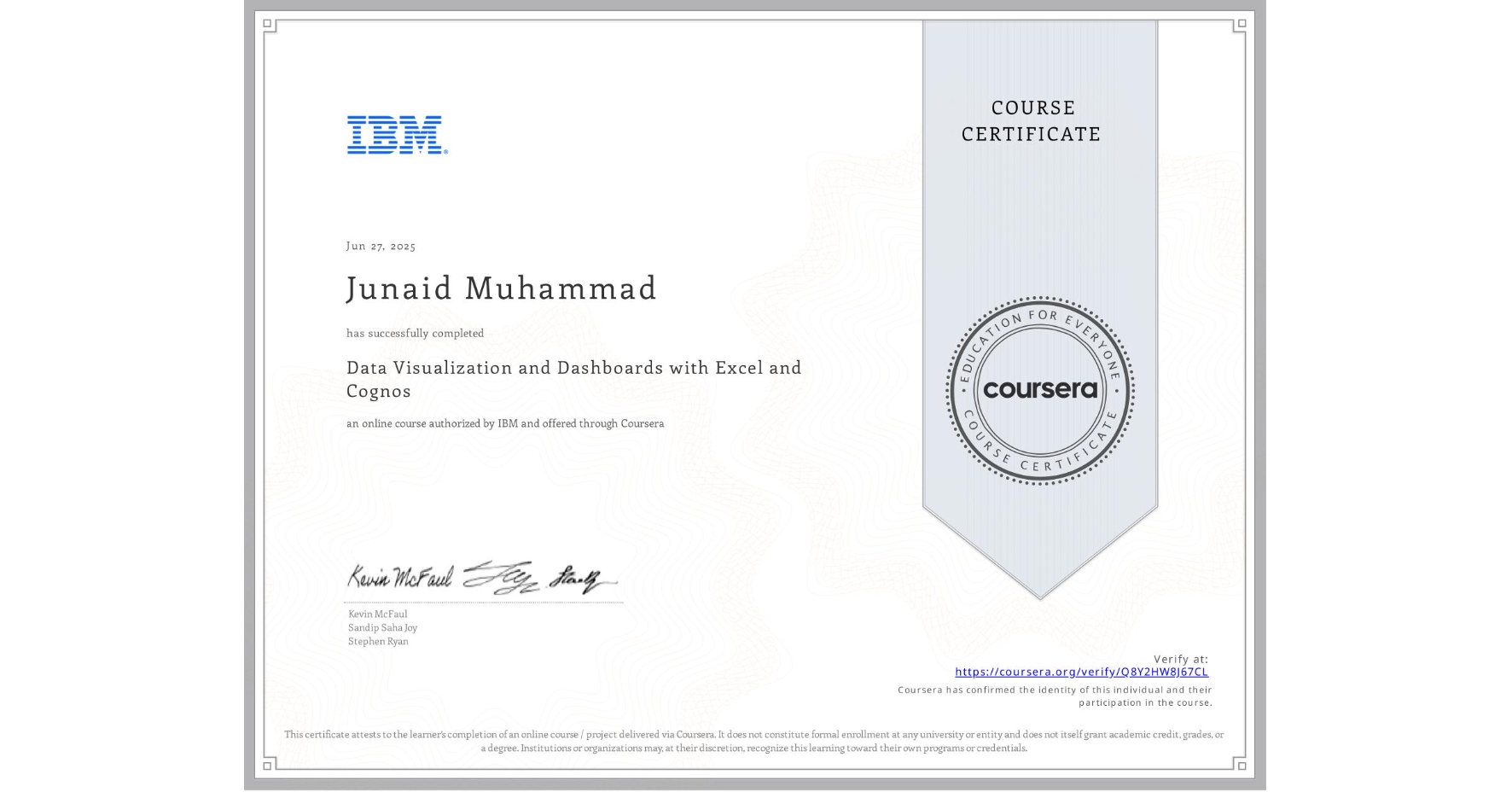
Data Visualization and Dashboards with Excel and Cognos
Completed by Junaid Muhammad
June 27, 2025
15 hours (approximately)
Junaid Muhammad's account is verified. Coursera certifies their successful completion of Data Visualization and Dashboards with Excel and Cognos

What you will learn
Create basic visualizations such as line graphs, bar graphs, and pie charts using Excel spreadsheets.
Explain the important role charts play in telling a data-driven story.
Construct advanced charts and visualizations such as Treemaps, Sparklines, Histogram, Scatter Plots, and Filled Map Charts.
Build and share interactive dashboards using Excel and Cognos Analytics.
Skills you will gain
- Category: IBM Cognos Analytics
- Category: Business Intelligence Software
- Category: Data Storytelling
- Category: Dashboard Creation
- Category: Data Presentation
- Category: Interactive Data Visualization
- Category: Pivot Tables And Charts
- Category: Microsoft Excel
- Category: Data Analysis
- Category: Scatter Plots
- Category: Tree Maps
- Category: Histogram