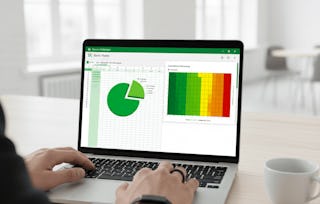
Business Data Visualization teaches learners how to transform data into clear, meaningful visualizations that support better business decisions. Through hands-on practice, learners explore how to select the appropriate charts and graphs, create visualizations in Microsoft Excel, and apply design principles that improve clarity and communication.

Business Data Visualization
La Fête du Travail commence avec plus de 70 $ d'économies sur Coursera Plus. Bénéficiez de 40 % de réduction pendant 3 mois.

Obtenez un aperçu d'un sujet et apprenez les principes fondamentaux.
niveau Débutant
Expérience recommandée
1 semaine à compléter
à 10 heures par semaine
Planning flexible
Apprenez à votre propre rythme
Ce que vous apprendrez
Create effective business data visualizations using Microsoft Excel.
Select appropriate charts and graphs to communicate business insights.
Interpret line graphs, bar charts, histograms, pie charts, and scatter plots.
Present data-driven recommendations using clear and effective visualizations.
Compétences que vous acquerrez
- Catégorie : Decision Making
- Catégorie : Data Literacy
- Catégorie : Data Storytelling
- Catégorie : Descriptive Statistics
- Catégorie : Plot (Graphics)
- Catégorie : Business Communication
- Catégorie : Trend Analysis
- Catégorie : Histogram
- Catégorie : Problem Solving
- Catégorie : Business Analytics
- Catégorie : Data Visualization
- Catégorie : Statistical Visualization
- Catégorie : Data Analysis
- Catégorie : Data Visualization Software
- Catégorie : Graphing
- Catégorie : Data-Driven Decision-Making
- Catégorie : Data Presentation
- Catégorie : Business Reporting
- Catégorie : Scatter Plots
Outils que vous découvrirez
- Catégorie : Microsoft Excel
Détails à connaître

Certificat partageable
Ajouter à votre profil LinkedIn
Récemment mis à jour !
juillet 2026
Évaluations
11 devoirs
Enseigné en Anglais
Découvrez comment les employés des entreprises prestigieuses maîtrisent des compétences recherchées

Il y a 2 modules dans ce cours
Instructeur

Offert par

En savoir plus sur Business Strategy

University at Buffalo


Pour quelles raisons les étudiants sur Coursera nous choisissent-ils pour leur carrière ?

Felipe M.
Étudiant(e) depuis 2018
’Pouvoir suivre des cours à mon rythme à été une expérience extraordinaire. Je peux apprendre chaque fois que mon emploi du temps me le permet et en fonction de mon humeur.’

Jennifer J.
Étudiant(e) depuis 2020
’J'ai directement appliqué les concepts et les compétences que j'ai appris de mes cours à un nouveau projet passionnant au travail.’

Larry W.
Étudiant(e) depuis 2021
’Lorsque j'ai besoin de cours sur des sujets que mon université ne propose pas, Coursera est l'un des meilleurs endroits où se rendre.’

Chaitanya A.
’Apprendre, ce n'est pas seulement s'améliorer dans son travail : c'est bien plus que cela. Coursera me permet d'apprendre sans limites.’




Foire Aux Questions
Plus de questions
Aide financière disponible,