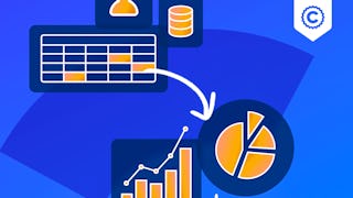
Excel Dashboard Courses
Excel Dashboard courses can help you learn data visualization techniques, how to create interactive dashboards, and effective data analysis methods. You can build skills in using formulas, pivot tables, and conditional formatting to present data clearly and concisely. Many courses introduce tools like Excel's Power Query and Power Pivot, which enhance your ability to manipulate large datasets and automate reporting processes.
Popular Excel Dashboard Courses and Certifications
 Status: Free Trial
Skills you'll gain: Data Storytelling, Data Presentation, Interactive Data Visualization, Data Visualization Software, Dashboard, Data Visualization, Dashboard Creation, IBM Cognos Analytics, Pivot Tables And Charts, Microsoft Excel, Tree Maps, Scatter Plots, Histogram, Business Intelligence Software, Data Analysis
 Status: Free TrialStatus: Free
Skills you'll gain: Dashboard, Microsoft Excel, Microsoft 365, Microsoft Office, Spreadsheet Software, Data Visualization, Document Management, Trend Analysis, Data Analysis
 Status: Free Trial
Macquarie University
Skills you'll gain: Pivot Tables And Charts, Data Storytelling, Power BI, Data Presentation, Microsoft Excel, Dashboard Creation, Data Visualization Software, Data Visualization, Interactive Data Visualization, Excel Formulas, Dashboard, Data Transformation, Spreadsheet Software, Excel Macros, Tree Maps, Data Analysis, Data Wrangling, Data Cleansing, Data Manipulation, Business Intelligence Software
 Status: NewStatus: Free Trial
Skills you'll gain: Dashboard, Dashboard Creation, Data Visualization, Data Presentation, Pivot Tables And Charts, Ad Hoc Reporting, Data Storytelling, Business Intelligence, Data Modeling, Concision, Design Reviews
 Status: Free Trial
Skills you'll gain: Data Visualization, Interactive Data Visualization, Data Presentation, Dashboard, Data Storytelling, Dashboard Creation, Data Visualization Software, Microsoft Excel, Spreadsheet Software, Graphing, Pivot Tables And Charts, Data Modeling, Database Development, Databases, Business Analysis Tools, Data Analysis, Simulation and Simulation Software, Data Analysis Software
 Status: Free Trial
Skills you'll gain: Excel Macros, Data Validation, Scatter Plots, Plot (Graphics), Pivot Tables And Charts, Microsoft Excel, Data Visualization, Regression Analysis, Excel Formulas, Statistical Visualization, Histogram, Data Analysis, Data Integrity, Statistical Modeling, Descriptive Statistics, Spreadsheet Software, Analytics, Financial Data, Financial Analysis, Automation
What brings you to Coursera today?
 Status: NewStatus: Free Trial
John Wiley & Sons
Skills you'll gain: Excel Macros, Pivot Tables And Charts, Microsoft Excel, Financial Forecasting, Spreadsheet Software, Excel Formulas, Data Visualization, Trend Analysis, Diagram Design, Visual Basic (Programming Language), Automation, Forecasting, Graphical Tools
 Status: Free
Skills you'll gain: Dashboard Creation, Google Sheets, Spreadsheet Software, Pivot Tables And Charts, Data Visualization, Data Analysis, Data Cleansing
 Status: NewStatus: Free Trial
Logical Operations
Skills you'll gain: Data Storytelling, Data Analysis Expressions (DAX), Excel Formulas, Data Transformation, Interactive Data Visualization, Data Presentation, Microsoft Excel, Datamaps, Data Visualization, Dashboard Creation, Sampling (Statistics), Dashboard, Pivot Tables And Charts, Data Analysis, Statistical Analysis, Data Cleansing, Microsoft Office, Geospatial Mapping, Microsoft 365, Productivity Software
 Status: NewStatus: Free Trial
Skills you'll gain: Dashboard, Dashboard Creation, Performance Analysis, Microsoft Excel, Trend Analysis, Forecasting, Performance Metric, Business Reporting, Data Visualization, Predictive Modeling, Excel Macros, Statistical Analysis, Excel Formulas, Business Modeling, Analysis, Probability & Statistics, Business Analysis
 Status: NewStatus: Free Trial
Skills you'll gain: Data Visualization, Dashboard Creation, Spreadsheet Software, Performance Reporting, Business Analytics, Business Reporting, Data Preprocessing
 Status: Free Trial
Macquarie University
Skills you'll gain: Pivot Tables And Charts, Data Storytelling, Data Presentation, Data Visualization Software, Data Visualization, Interactive Data Visualization, Dashboard Creation, Spreadsheet Software, Dashboard, Microsoft Excel, Excel Macros, Tree Maps, Excel Formulas, Data Analysis, Forecasting, Geospatial Mapping
In summary, here are 10 of our most popular excel dashboard courses
- Data Visualization and Dashboards with Excel and Cognos: IBM
- Create Charts and Dashboards Using Microsoft Excel: Coursera
- Excel Skills for Data Analytics and Visualization: Macquarie University
- Dynamic Dashboards: Report and Visualize Data: Coursera
- Data Visualization with Advanced Excel: PwC
- Advanced Excel Analytics, Automation & Data Analysis: EDUCBA
- Excel Charts, Sharing, Automation, and VBA: John Wiley & Sons
- Create Charts and Dashboard using Google Sheets: Coursera
- Data Analysis and Visualization with Microsoft Excel: Logical Operations
- Build Interactive Sales Dashboards in Excel: EDUCBA


