This course gives you a complete, practical toolkit for visualizing and analyzing data across more than 20 chart types. You'll identify which graph suits any dataset, configure it correctly, and present findings clearly to both specialist and non-specialist audiences.

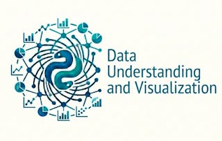
Basics of Data Visualization Analysis
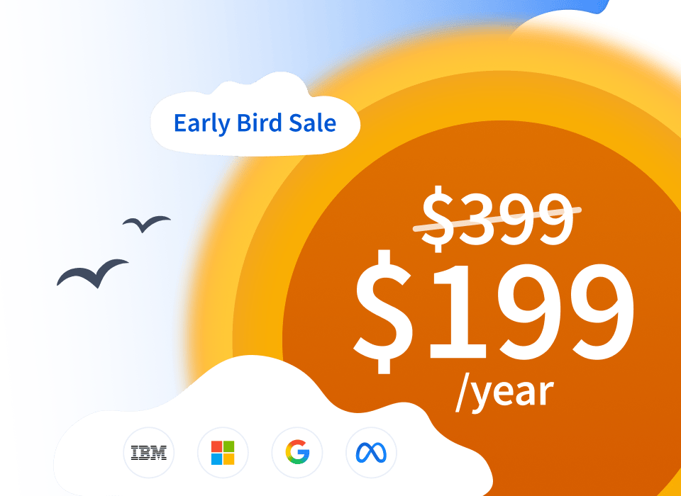
Ends soon! Get one of our best deals with Coursera Plus for $199 (usually $399). Save now.

Basics of Data Visualization Analysis
This course is part of Data Visualization with Excel and Python Specialization

Instructor: Madecraft
Included with
Gain insight into a topic and learn the fundamentals.
Beginner level
Recommended experience
5 hours to complete
Flexible schedule
Learn at your own pace
What you'll learn
Select and configure the right chart type for any continuous or discrete dataset.
Analyze data distributions using histograms, density plots, box plots, and violin plots.
Identify and visualize data relationships with scatter plots, lines of best fit, line plots, and bubble plots.
Details to know

Shareable certificate
Add to your LinkedIn profile
Recently updated!
June 2026
Taught in English
See how employees at top companies are mastering in-demand skills

Build your subject-matter expertise
This course is part of the Data Visualization with Excel and Python Specialization
When you enroll in this course, you'll also be enrolled in this Specialization.
- Learn new concepts from industry experts
- Gain a foundational understanding of a subject or tool
- Develop job-relevant skills with hands-on projects
- Earn a shareable career certificate


Explore more from Data Analysis
 Status: Free Trial
University of Colorado Boulder
 Status: Free Trial
Microsoft
 Status: Free Trial
 Status: Free Trial
Why people choose Coursera for their career

Felipe M.
Learner since 2018
"To be able to take courses at my own pace and rhythm has been an amazing experience. I can learn whenever it fits my schedule and mood."

Jennifer J.
Learner since 2020
"I directly applied the concepts and skills I learned from my courses to an exciting new project at work."

Larry W.
Learner since 2021
"When I need courses on topics that my university doesn't offer, Coursera is one of the best places to go."

Chaitanya A.
"Learning isn't just about being better at your job: it's so much more than that. Coursera allows me to learn without limits."


¹ Some assignments in this course are AI-graded. For these assignments, your data will be used in accordance with Coursera's Privacy Notice.