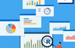
Data visualization is a critical skill for anyone that routinely using quantitative data in his or her work - which is to say that data visualization is a tool that almost every worker needs today. One of the critical tools for data visualization today is the R statistical programming language. Especially in conjunction with the tidyverse software packages, R has become an extremely powerful and flexible platform for making figures, tables, and reproducible reports. However, R can be intimidating for first time users, and there are so many resources online that it can be difficult to sort through without guidance.
Publishing Visualizations in R with Shiny and flexdashboard
Ends soon! Get one of our best deals with Coursera Plus for $199 (usually $399). Save now.
Publishing Visualizations in R with Shiny and flexdashboard
This course is part of Data Visualization & Dashboarding with R Specialization

Instructor: Collin Paschall
6,723 already enrolled
Included with
Gain insight into a topic and learn the fundamentals.
72 reviews
1 week to complete
at 10 hours a week
Flexible schedule
Learn at your own pace
Skills you'll gain
Tools you'll learn
Details to know

Shareable certificate
Add to your LinkedIn profile
Assessments
5 assignments
Taught in English
See how employees at top companies are mastering in-demand skills

Build your subject-matter expertise
This course is part of the Data Visualization & Dashboarding with R Specialization
When you enroll in this course, you'll also be enrolled in this Specialization.
- Learn new concepts from industry experts
- Gain a foundational understanding of a subject or tool
- Develop job-relevant skills with hands-on projects
- Earn a shareable career certificate

There are 3 modules in this course
Earn a career certificate
Add this credential to your LinkedIn profile, resume, or CV. Share it on social media and in your performance review.
Instructor
Instructor ratings
(30 ratings)Offered by
Explore more from Data Analysis
 Status: Free Trial
Johns Hopkins University
 Status: Free Trial
Johns Hopkins University
 Status: Free Trial
Johns Hopkins University
 Status: Free Trial
Johns Hopkins University
Why people choose Coursera for their career

Felipe M.
Learner since 2018
"To be able to take courses at my own pace and rhythm has been an amazing experience. I can learn whenever it fits my schedule and mood."

Jennifer J.
Learner since 2020
"I directly applied the concepts and skills I learned from my courses to an exciting new project at work."

Larry W.
Learner since 2021
"When I need courses on topics that my university doesn't offer, Coursera is one of the best places to go."

Chaitanya A.
"Learning isn't just about being better at your job: it's so much more than that. Coursera allows me to learn without limits."
Learner reviews
- 5 stars
90.27%
- 4 stars
8.33%
- 3 stars
0%
- 2 stars
1.38%
- 1 star
0%
Showing 3 of 72
AA
Reviewed on May 27, 2021
Another one! And it's getting better and better. Enjoyed every bit of it, thank you.
JC
Reviewed on Mar 18, 2022
Excellent introductory course on creating and publishing your dashborards and interactive graphics.
IL
Reviewed on Sep 30, 2021
This course is a good start for people who are interested in learning about R Shiny and flexdashboard.