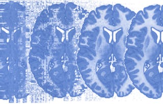
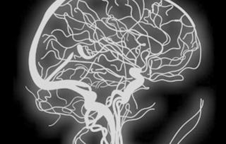
0:03
Hi, in this module we'll continue with model building.
So this is model building part 3, and we'll talk about filtering and
nuisance covariance.
So to recap where we are,
we're working with the standard GLM model which can be written in the following way.
So we have Y, which is the FMRI data strung out over time from a single voxel.
We have the design matrix X.
We have the regression coefficients beta, and we have the noise vector epsilon.
And epsilon is assumed to follow a normal distribution with mean 0 and variance,
covariance matrix V, whose format depends on the noise model.
So what we've been talking about is how to build a good design matrix,
and often model factors associated with known sources of variability
that are not directly related to the task or
the experimental hypothesis also need to be included in the GLM model.
Examples of such possible nuisance regressors include the signal drift,
physiological artifacts such as respiration and head motion,
so sometimes we include six regressors comprising of three translations and
three rotations, which are estimated during the preprocessing stage.
Also sometimes we use transformations of these six regressors are also included.
1:19
So to start, let's talk a little bit about how to include drift into our model.
And so again, to recap what we talked about a few modules ago,
drift is slow changes in voxel intensity over time,
which is low-frequency noise, and this is often present in fMRI signal.
And so again, scanner instabilities and
not motion or physiological noise is the main cause of drift.
Drift has also been seen in phantoms and cadavers.
And so we need to include drift parameters in our models.
So we often model drift using, say, splines, or polynomial basis sets, or
discrete cosine basis sets.
So here's an example of a model, a GLM model, with drift components included.
And this is a discrete cosine basis.
So here the design matrix has 11 columns.
One is sort of a boxcar shape which corresponds to the task.
The second one, column, is a baseline, and
then columns 3 through 9 correspond to the discrete cosine basis set,
which is supposed to model the drift component present in the data.
2:38
Now if we were to fit,
use all the columns of the design matrix, we would get the green predicted response.
And so this takes into account the low-frequency drift.
So here you see that the green curve fits the data quite well.
Now what are the relative contributions of drift and of the boxcar?
Well, if we looked at the red curve,
this is the predictor response with the low-frequency drift explained away.
So here we see the size of the activation in controlling for the effects of drift.
The black curve, on the other hand, shows us the low-frequency drift,
and that's sort of a nuisance parameter that we want to remove.
We don't think that that's important, and
doesn't tell us anything about the task at hand.
But this is sort of just instabilities in the scanners.
We want to remove the black line and get to the red line,
which we find controlling for the drift is sort of the signal of interest.
3:39
Another type of artifact that we should control for
is transient gradient artifacts.
So we talked a little bit about this in the artifact module,
that we often get kind of spikes in the data due to artifacts.
And here we see examples of a few spikes in the data.
So we often want to kind of control for these spikes in our subsequent models.
So here's a way of modeling transient gradient artifacts, and
so there's a number of ways to check on this.
And so here we're seeing that,
a little movie which is showing how we can do outlier detection.
So there's two sort of curves that we're looking at here.
The top curve is the global mean.
Here we don't really spot very much, but
if you look at the middle one, this is the successive differences,
where it's actually the root mean square of the successive differences.
And this allows us to see transient gradient artifacts very nicely, and
you can see every time there's a spike there you get
kind of a funny looking image where there looks like there's artifacts in it.
So these are sort of the types of images that we want to control for and
include as covariates in our design matrix.
So we want to include one regressor per bad image.
And so here is what example nuisance regressors in x might look like.
So, we would have first, we would control usually the first four images or
something, are removed or
not included in the analysis because of equilibrium issues.
So we usually treat them as nuisance regressors, and
then we include a nuisance regressor which is just a spike,
5:13
indicating the image where we had an artifact.
And that sort of uses one degree of freedom to kind of mop up the variation
due to that spike, and that's a way that we often analyze data in practice.
So physiological noise such as respiration and
heart rate, again as we talked about earlier,
give rise to periodic noise, which is often aliased into the task frequencies.
And it can potentially be modeled if the temporal resolution of the study is high
enough, but if the TR is too low, there's always going to be problems with aliasing.
And so, again, according to the Nyquist criterion, the sampling rating must be at
least twice as big as the frequency of the curve that we seek to model.
So, for these reasons, this type of noise is often difficult to remove,
and is often left in the data, giving rise to temporal autocorrelations.
However, there are ways to sort of monitor physiological artifacts and
thereafter remove them from, include them in your model.
So, there's two main ways of modelling this,
and this includes RETROICOR and RVHRCOR.
And so they do it in slightly different ways,
taking into consideration factors such as neuronal activation,
respiration cycle, the cardiac cycle, respiration volume, and heart rate.
Here's a slide showing differences in activation maps
when you use no RETROICOR and when you use RETROICOR.
Here we see that there's more activation when using RETROICOR in areas
that we expect to be active during this particular
task >> Head movement
presents one of the biggest challenges in the analysis and correction of artifacts.
What you're seeing here is the head movement parameter
estimates from the realignment from one person.
And as you can see, everybody moves their head, some people more than others,
sometimes more than others.
And often people will exclude participants who move their head more than a certain
amount, like more than one millimeter, for example, within a run.
But this can also present its own challenges.
7:24
So head movement can give rise to serious problems.
Basic motion correction, or image realignment,
is performed in the preprocessing stages of the analysis.
And this takes care of the gross adjustment differences across the images,
for the most part.
However, motion also induces complex artifacts due to the spin history and
due to changes in the magnetic field that are introduced by motion,
and these cannot be removed.
7:54
So at least two important papers recently have highlighted the influence of head
motion and how it can be a compound in a number of analyses.
So for example, if you're looking at functional connectivity across old and
young subjects, and young subjects move their head more, you can end up with
a systematic bias towards increased functional connectivity that's local in
the young subjects, because you're essentially blurring the brain locally.
And that's just an example, one example,
of many kinds of head movement related artifacts that we might run into.
So we have to be very careful.
There are two basic approaches for how to deal with head movement now.
One of them is to include nuisance regressors in your design matrix
that model movement, and we'll see an example of that later.
People are also sometimes include measurements of global cerebrospinal fluid
spinal fluid, ventricle activity, as covariates to account for
movement in various kinds of other physiological noise or junk.
The second approach is called scrubbing,
which refers to the practice of dropping images with high estimated movement.
So essentially you're removing a number of images from the time series,
entering those as missing data.
9:13
This is an example of what it would look like to model movement with additional
nuisance covariates.
So here on the left, what you see is a design matrix, or part of one.
And each of those blocks that you see includes some task-related regressors, and
a number of regressors that we've added to capture head movement.
So we have a bunch of them, because we're modeling not just the linear movement
parameter estimates that you saw from the previous slide,
we're also modeling their squares, there are successive differences,
which is related to the derivative and their squared successive differences.
So from every run, we include 24 additional movement parameter covariates.
So let's look at an example of how movement can be a problem, and
how this practice of introducing additional covariates might help.
So this is an example of a group analysis from 25 people
who performed a fear conditioning task.
And so we're looking at activity related to the CS+, which was cues that predict
shock, versus the CS-, which is cues that don't predict shock, safe cues.
10:22
And you think in a group analysis that a lot of the problems with individual images
and artifacts should average out.
But in this case, they don't,
because we see significant results in the group analysis in many areas of the brain
that are physiologically implausible, in the ventricles, for example.
10:48
So what you're seeing here is one histogram for every participant
that shows the contrast values across the brain for that participant.
So this is, for one subject here in the top left,
you can see the distribution across the entire brain.
Now this should be roughly mean 0, unless there's whole brain activation or
deactivation.
11:21
So here, what do we see?
Well, we see a lot of problems.
So look at this subject here, number 4.
We see physiologically implausible whole-brain deactivation.
The entire set of contrast values across the brain
have shifted towards deactivated, and
they're massively deactivated compared to the range in most of the subjects.
11:46
And look at this.
Now, this subject down here is an example of one that shows physiologically and
plausible whole-brain activation.
So it is possible that we can get some diffuse modulatory effects that can induce
some global shifts in the images in the contrast values.
But changes on this scale and changes that are so inconsistent across participants
really are way outside the range of what's physiologically plausible.
12:10
So now let's adjust our design matrix.
What we're going to do is add nuisance covariates.
So you see on the left the previous design
where we've modeled the various kids of events involved.
And we're interested in just the CS+ versus CS- comparison here, so
it's a contrast across those regressors that we're interested in.
Now we've added a number of motion covariates, the 24 per run that I told you
about earlier, and those are in green and we've also done some outlier detection and
estimated where we might have in spikes in the data.
We've modeled those as well.
12:45
So now, let's see what happens afterwards.
Well, if we look at the histograms of the contrast values,
there's still some problems.
Not every subject looks the same, essentially, but they're much better.
13:00
Almost all of them are really centered very closely on 0,
which means there's no whole brain activation or deactivation with the CS+.
And the distributions look more on the same scale, although still,
as we said, it's not perfect, and that's the noise that we have to live with.
13:19
So now let's look at what happens in our group analysis.
This was before, and this is after.
So things look much more physiologically plausible.
So there's the implausible ventricle deactivation, and
here we see an expected pattern based on previous studies.
And what we should see is dorsal anterior cingulate increases,
which you see in yellow, and PAG increases, which you see in yellow,
among other regions, and deactivation of the so called default mode network
in the ventromedial prefrontal cortex and posterior cingulate cortex.
So this looks like a very plausible map.