Data Visualization Courses
Data visualization courses can help you learn how to create compelling charts, graphs, and dashboards, along with understanding data storytelling and visual design principles. You can build skills in interpreting data trends, selecting appropriate visual formats, and conveying insights effectively to diverse audiences. Many courses introduce tools like Tableau, Power BI, and D3.js, that support transforming raw data into visual narratives and making data-driven decisions in various fields.
Popular Data Visualization Courses and Certifications
 Status: Free TrialStatus: Free
Coursera
Skills you'll gain: Data Visualization, Data Literacy, Data Presentation, Google Sheets, Data Compilation, Data Visualization Software, Statistical Visualization, Graphing, Spreadsheet Software
 Status: Free
Coursera
Skills you'll gain: Plotly, Exploratory Data Analysis, Scatter Plots, Plot (Graphics), Data Visualization, Data Visualization Software, Interactive Data Visualization, Data Analysis, Python Programming
 Status: Free TrialStatus: Free
Skills you'll gain: Microsoft Excel, Excel Formulas, Pivot Tables And Charts, Data Analysis, Data Manipulation, Microsoft Office, Data Mining
 Status: Free TrialStatus: Free
Skills you'll gain: Microsoft Excel, Excel Formulas, Spreadsheet Software, Microsoft Office, Microsoft 365
 Status: Free
Skills you'll gain: Dashboard Creation, Google Sheets, Spreadsheet Software, Pivot Tables And Charts, Data Visualization, Data Analysis, Data Cleansing
 Status: Free TrialStatus: Free
Skills you'll gain: Presentations, Microsoft PowerPoint, Data Visualization, Video Editing
What brings you to Coursera today?
 Status: Free
Skills you'll gain: Exploratory Data Analysis, Box Plots, Plot (Graphics), Data Visualization, Ggplot2, Data Visualization Software, Statistical Visualization, Scatter Plots, Histogram, Data Analysis, Graphing, Python Programming
 Status: Free
Coursera
Skills you'll gain: Plot (Graphics), Spatial Data Analysis, Data Visualization Software, Data Visualization, Geospatial Mapping, Software Installation, Python Programming
 Status: Free
Skills you'll gain: Google Analytics, Web Analytics and SEO, Statistical Reporting, Data-Driven Marketing, Analytics, Data Analysis, User Accounts
 Status: Free TrialStatus: Free
Skills you'll gain: Dashboard, Microsoft Excel, Microsoft 365, Microsoft Office, Spreadsheet Software, Data Visualization, Document Management, Trend Analysis, Data Analysis
 Status: Free
Coursera
Skills you'll gain: HubSpot CRM, Customer Relationship Management (CRM) Software, Customer Relationship Management, Customer Data Management, Email Marketing, Business Software, Customer Communications Management, Sales Pipelines, Dashboard, Account Management, Data Management, Customer Service, Marketing, Sales Operations, Team Building
 Status: Free
Coursera
Skills you'll gain: Portfolio Risk, Investment Management, Risk Management, Financial Analysis, Financial Management, Risk Modeling, Risk Analysis, Portfolio Management, Financial Market, Investments, Statistics
Best free Data Visualization courses
High-quality free Data Visualization courses you can start today.
- Overview of Data VisualizationCourseraBeginnerLess Than 2 HoursFree
- Data Visualization using PlotlyCourseraIntermediateLess Than 2 HoursFree
- Introduction to Data Analysis using Microsoft ExcelCourseraIntermediateLess Than 2 HoursFree
Best Data Visualization courses from Coursera
Top-rated Data Visualization courses offered by Coursera on Coursera.
- Getting Started with Microsoft ExcelCourseraIntermediateLess Than 2 HoursCoursera
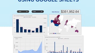
- Create Charts and Dashboard using Google SheetsCourseraBeginnerLess Than 2 HoursCoursera
- How To Visualize Your Data Using Microsoft PowerpointCourseraBeginnerLess Than 2 HoursCoursera
Best Data Visualization courses for beginners
Top-rated beginner-friendly Data Visualization courses with no prerequisites.
- Getting Started in Google AnalyticsCourseraBeginnerLess Than 2 HoursNo prerequisites
- Introduction to CRM with HubSpotCourseraBeginnerLess Than 2 HoursNo prerequisites
Best short Data Visualization courses
Quick Data Visualization courses you can complete in a few hours or less.
- Data Visualization using Plotnine and ggplotCourseraIntermediateLess Than 2 HoursQuick completion
- Data Visualization using BokehCourseraIntermediateLess Than 2 HoursQuick completion
- Create Charts and Dashboards Using Microsoft ExcelCourseraIntermediateLess Than 2 HoursQuick completion


