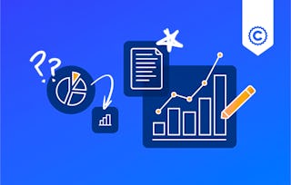
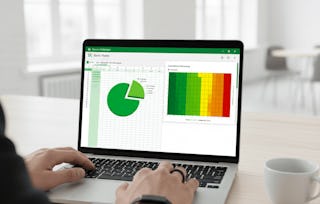
Learn how to create data visualizations and dashboards using spreadsheets and analytics tools. This course covers some of the first steps for telling a compelling story with your data using various types of charts and graphs. You'll learn the basics of visualizing data with Excel and IBM Cognos Analytics without having to write any code.

Data Visualization and Dashboards with Excel and Cognos

Data Visualization and Dashboards with Excel and Cognos
This course is part of multiple programs.


Instructors: Sandip Saha Joy
236,950 already enrolled
Included with
4,474 reviews
Recommended experience
What you'll learn
Create basic visualizations such as line graphs, bar graphs, and pie charts using Excel spreadsheets.
Explain the important role charts play in telling a data-driven story.
Construct advanced charts and visualizations such as Treemaps, Sparklines, Histogram, Scatter Plots, and Filled Map Charts.
Build and share interactive dashboards using Excel and Cognos Analytics.
Skills you'll gain
Tools you'll learn
Details to know

Add to your LinkedIn profile
See how employees at top companies are mastering in-demand skills

Build your subject-matter expertise
- Learn new concepts from industry experts
- Gain a foundational understanding of a subject or tool
- Develop job-relevant skills with hands-on projects
- Earn a shareable career certificate

There are 4 modules in this course
Earn a career certificate
Add this credential to your LinkedIn profile, resume, or CV. Share it on social media and in your performance review.
Offered by
Explore more from Data Analysis
Why people choose Coursera for their career

Felipe M.

Jennifer J.

Larry W.

Chaitanya A.
Learner reviews
- 5 stars
77.67%
- 4 stars
17.22%
- 3 stars
2.79%
- 2 stars
1.20%
- 1 star
1.09%
Showing 3 of 4474
Reviewed on Jun 5, 2022
It is very constructive and very important course for the future of data analyst career. providing practical handin experience makes it the perfect self starter and motivational course. Thank you
Reviewed on Aug 10, 2022
Having taking the tutorial class, i can say it enriched me with alot of information about Data Analytics. Tools for visualization such as Excel and Cognos, gives important clearity about data.
Reviewed on Aug 13, 2021
This course was not easy, I have never used IBM Cognos before. I was nervous logging into it and making sure I am doing it right. I end up using 2 monitors to see what I am doing.

Open new doors with Coursera Plus
Unlimited access to 10,000+ world-class courses, hands-on projects, and job-ready certificate programs - all included in your subscription
Advance your career with an online degree
Earn a degree from world-class universities - 100% online
Join over 3,400 global companies that choose Coursera for Business
Upskill your employees to excel in the digital economy
¹ Some assignments in this course are AI-graded. For these assignments, your data will be used in accordance with Coursera's Privacy Notice.


